 Magoo Component UI
CSS-less skeletons · 4 themes
Magoo Component UI
CSS-less skeletons · 4 themes
Magoo Component UI
CSS-less skeletons · 4 themes
Magoo Component UI
CSS-less skeletons · 4 themes 
error-404 A not-found page block with a big code, search, and back-home.

error-500 A server-error block with retry, home, and an incident ID.
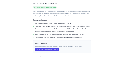
accessibility-statement A document-style accessibility compliance statement — conformance badge, intro, a checklist of commitments, a feedback contact, and a review date.

accordion Stacked expandable panels with keyboard support and an optional single-open mode.

accordion-item A single collapsible header + panel to place inside an accordion; the panel body is a slot.

account-balance-card A bank account card with balance, masked number, and a trend delta.

account-menu An avatar dropdown with account info and menu items.

achievement-row An achievement with icon, rarity, progress, and unlocked state.

activity-feed-item An actor–verb–object activity row with a timeline rail and timestamp.

activity-ring Concentric radial progress rings (move / exercise / stand) with a labelled goal legend.

activity-summary A compact recent-activity feed with actor/action/target lines and timestamps.

activity-timeline A vertical log of calls, emails, notes, and meetings, each entry marked and colour-coded by type.
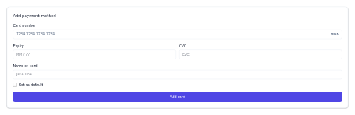
add-payment-method A card entry form with number, expiry, CVC, and set-default.

add-to-calendar A dropdown button to add an event to Google/Apple/Outlook or download .ics.

add-to-cart-bar A sticky bottom bar with product name, price, and an add-to-cart action.
adoption-card An adoptable pet card with a photo or paw glyph, name, breed and age, shelter, a status badge, and a call-to-action button.

affordability-meter A gradient affordability gauge positioning a home against the buyer's budget.

age-gate A centered card that asks a visitor to confirm they meet a minimum age before entering.

agency-process A numbered, responsive row of process steps, each a tinted number badge over a title and short description.

calendar-agenda An agenda/list day view grouping events under each date.

agent-card A compact contact card for an insurance agent - avatar, name, title, rating and call and email buttons.

agent-contact-card A real-estate agent card with photo, rating, and call/message actions.

chat-message-ai A single assistant reply with an AI avatar, message bubble, and a copy/rate/regenerate action row.

code-block-ai A code block with a language header, one-click copy, and an optional Run button for AI-generated snippets.

air-quality-index An AQI gauge with the value, category, and health advice.

air-quality-tile A compact air-quality reading with a colour-coded AQI value, level label, and a scale bar.
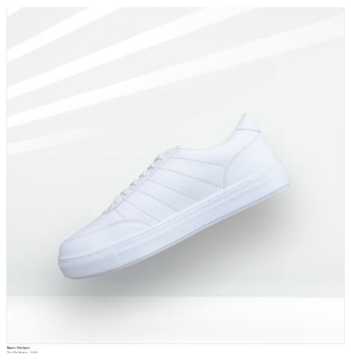
album-card An album cover card with title, artist, year, and a hover play button.

alert An inline alert that flags a message with a severity accent and optional dismiss.

allergen-list An allergen information panel with icons and a cross-contamination note.
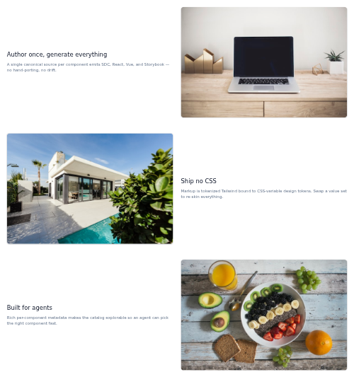
feature-alternating Alternating image/text feature rows down the page.

amenities-list An icon + label grid of property or venue amenities.

anchor-subnav A sticky horizontal in-page section nav that highlights the active section on scroll.
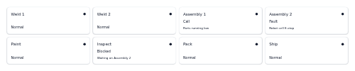
andon-board A grid of station tiles coloured by status - normal, call, fault or blocked - for a shop-floor andon display.

anniversary-card A small celebratory card marking a person's work anniversary with their years of service.

announcement-bar A dismissible full-width top strip for a promo or notice with an optional CTA.

anomaly-callout A spike/drop flag on a metric with a change and investigate action.

api-key-card A card that displays an API key masked, with reveal, copy, and rotate actions plus scope and created meta.

api-method-badge A small colour-coded pill showing an HTTP verb (GET, POST, PUT, PATCH, DELETE) for API docs and endpoint lists.
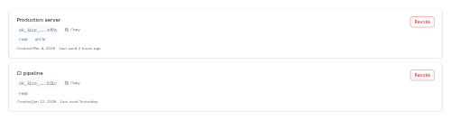
api-token-list A list of API tokens showing each token's name, masked key with copy button, scope chips, meta, and a revoke action.

card-app An app store-style row with an icon, name, rating, category, and install button.
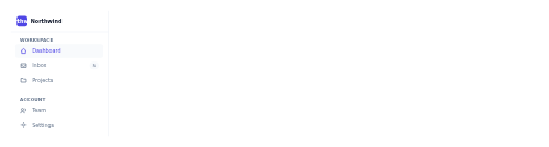
app-sidebar The primary left-hand navigation rail for a SaaS app, with grouped, icon-led links.

app-topbar The top bar of a SaaS app shell, with a menu toggle, global search, notifications, and a user avatar.
product-card-apparel A fashion product card with image, price, color dots, and a wishlist button.

appliance-usage-row A compact row breaking down one appliance's energy use, with an icon, a share-of-total bar, kWh, cost, and an on or off status dot.
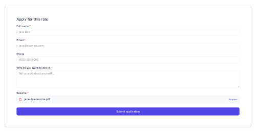
application-form A job application form with fields, a resume attachment, and submit.

application-status A hiring pipeline tracker showing an application's stage.
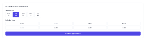
appointment-booker A provider appointment booker with day and time-slot selection.

appointment-slot A single bookable time slot with available/selected/booked states.

approval-request-row A pending-request row with the requester, request type and detail, an optional amount and date, and approve/deny buttons.
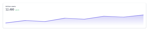
chart-card-area An area-chart widget with a gradient fill under a trend line.
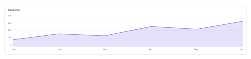
area-chart-shell A card-framed area-chart skeleton that fills under a precomputed series line, with an optional second area.

article-header An article title block with category, subtitle, byline, and a hero image.
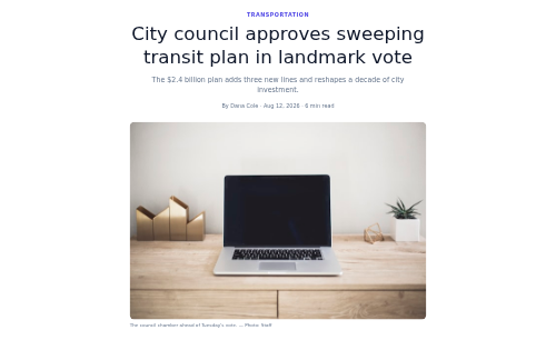
article-lead A lead story block with kicker, headline, standfirst, byline, and lead image.

artist-hero An artist banner with verified badge, monthly listeners, and play/follow.
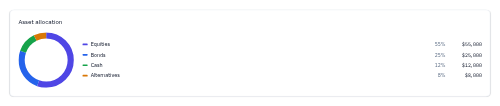
asset-allocation-donut A tokenized SVG donut of portfolio allocation by asset class, rendered from caller-precomputed slice geometry, with a value legend.

assignee-avatars An overlapping stack of task assignees with an optional "+N" overflow count.

assignment-card An assignment card with due date, status pill, and a submit action.
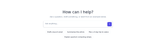
assistant-hero A centered landing hero for an AI assistant - a big heading, a large prompt input, and example-prompt chips.

attachment-row A single email attachment line showing a file-type icon, name, size and a download button.

attendance-row A single-person time-and-attendance row with clock-in/out times, hours worked and a status pill.
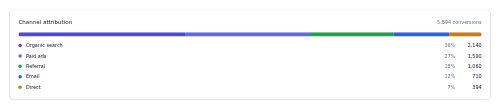
attribution-breakdown A channel-contribution breakdown with a stacked bar and legend.

audio-player A standalone audio player with play/pause, progress scrubber, and time.

audio-visualizer An animated bar visualizer shell for audio playback.

audio-waveform A waveform seek control with played bars highlighted and click-to-seek.

author-bio An author bio block with avatar, role, bio text, and follow/links.
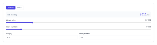
finance-calculator-auto A finance/lease payment calculator with price, down, APR, and term.

autocomplete-panel A search input with a floating popover of grouped, iconed suggestions that opens on focus and typing.

automation-rule-row An if/then automation row with trigger and action chips and an enable switch.
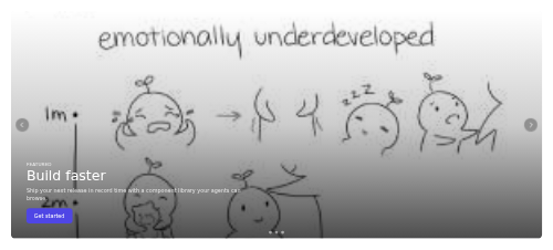
carousel-autoplay A full-width single-slide hero rotator that auto-advances with dots, arrows and a progress bar, pausing on hover or focus.
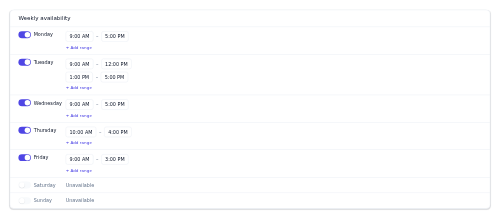
availability-scheduler A weekly availability editor with per-day toggles and time ranges.

avatar A user image with an initials fallback, configurable size and shape.

avatar-group An overlapping stack of avatars with an optional "+N" overflow count.

avatar-uploader An avatar preview with upload and remove actions.

award-row A single award line - year, award name and organization, with an optional category pill.

axis-controls A small chart toolbar with a scale toggle, a gridlines switch, and optional zoom controls.

back-to-top A scroll-aware floating button that appears after scrolling and returns to the top.

backlog-item A single backlog row with a type icon, priority dot, title, optional tag, and an effort-estimate badge.

badge A small status/label pill with a severity or brand color variant.
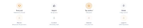
badge-showcase A grid of earned and locked community badges with tier-coloured medallions and lock overlays.

baggage-allowance A cabin/checked baggage allowance summary with included/not-included status.
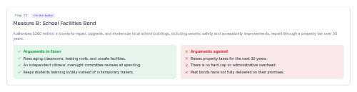
ballot-measure A summary card for a ballot measure or proposition — title, ID, status, a neutral summary, and side-by-side arguments for and against.
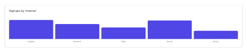
chart-card-bar A categorical bar-chart widget with hover values and category labels.
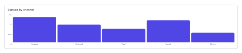
bar-chart-shell A card-framed vertical bar-chart skeleton driven by precomputed bar heights.
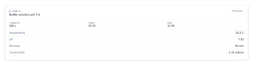
batch-record A card summarising a production batch - identifier, product, quantity, timing and process parameters with out-of-spec values flagged.

battery-storage-tile A tile showing a home battery's state of charge with a fill visual, its status, capacity, power flow, and backup runtime.
before-after-service A side-by-side pair of before and after photos documenting completed field-service work.

beneficiary-row A row showing a policy beneficiary, their relationship, allocated share percentage, and primary or contingent standing.
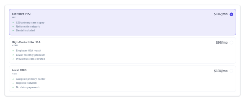
benefits-enrollment A single-select card of benefit plans, each with a tier, premium, feature list and a selected radio state.

benefits-grid An icon+label grid of job benefits and perks.
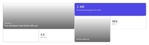
bento-grid A dense grid of mixed-size tiles for an editorial or dashboard "bento" layout, where each child claims its own footprint.
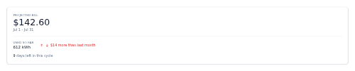
bill-estimate A card projecting the current cycle's electricity bill, with usage so far, a trend versus last cycle, and days remaining.

bill-pay-card A bill row with payee, due date, amount, and a pay action.
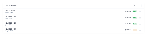
billing-history An invoices list container with an export-all action.
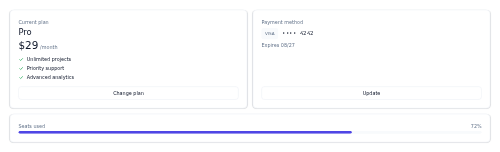
billing-tab A billing summary pairing a current-plan card and a payment-method card, with an optional usage bar below.
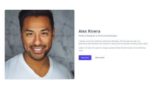
bio-hero A personal introduction hero - a portrait beside a name, role, rich intro text, and call-to-action buttons.

birthday-reward A celebratory card that greets a member on their birthday and highlights a reward with an expiry note.

card-blog A blog/article preview card with a cover image, category, title, excerpt, and byline.

board-column-header A kanban column header with a card count and an optional WIP-limit pill that flags overages.

boarding-pass A boarding pass with route, passenger, boarding/gate/seat, and a barcode stub.
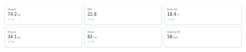
body-metrics A responsive grid of body-measurement tiles - weight, BMI, body fat and more - each with an optional signed change.
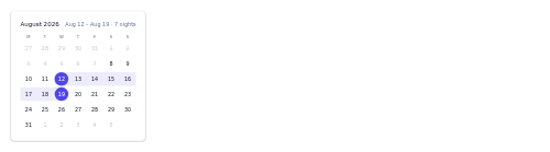
booking-date-range A start/end date-range picker with a highlighted range and summary.
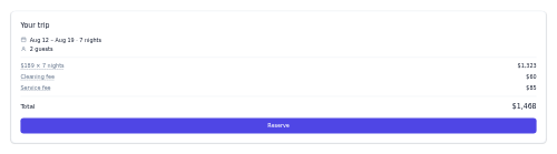
booking-summary A trip booking summary with dates, guests, a price breakdown, and a reserve CTA.

bottom-nav A mobile bottom tab bar with icon-plus-label tabs, an active state, and optional badges.

brand-deal-tracker A sponsorship card tracking deliverable status with a progress bar and payment note.

breadcrumb A hierarchical path of links with separators, ending in the current page.

breaking-news-bar An urgent breaking-news strip with a label, headline, and time.
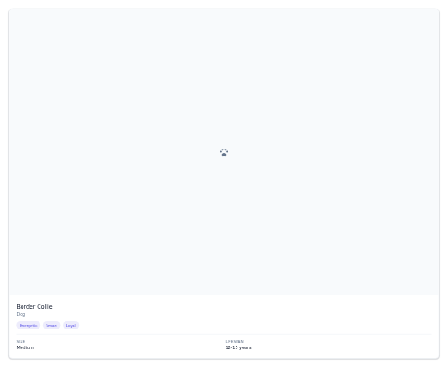
breed-card A breed info card with a breed image or paw glyph, name, size, temperament chips, and lifespan.
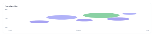
bubble-chart-shell A card-framed bubble-chart skeleton that plots precomputed x/y points sized by a third value.

budget-progress A spent-vs-budget bar for a category with an over/warning status colour.
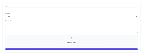
bug-report-form A report-an-issue form with a title, severity select, description, and a dashed file-attach dropzone.
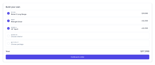
build-your-own A vehicle configurator step list with choices, prices, and a running total.

bulk-actions-bar A selection bar showing the selected count and a row of batch action buttons.
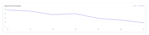
burndown-chart A sprint-burndown card that draws a dashed ideal line against a precomputed actual remaining-work line.

button A labeled action button with variant, size, and optional leading/trailing icon slots.

button-group A segmented set of mutually-exclusive buttons with a single active state.

byline An author byline with avatar, name, date, and read time.

byline-popup A byline that reveals an author bio card on hover or focus.
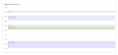
calendar-day-view A single-day hour grid with positioned events.

calendar-event-chip A colored event pill for a calendar grid cell.
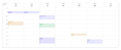
calendar-week-view A 7-day time grid with positioned events per day column.
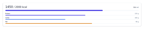
calorie-tracker A daily calorie intake-vs-goal card with a headline figure, progress bar and macro breakdown.
camera-feed-tile A security-camera tile with a placeholder preview, a status badge, and a name caption.
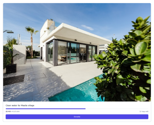
campaign-card A cause card with an image, title, progress bar, raised-of-goal line, days left, and a Donate button.
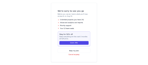
cancel-flow A retention cancel step showing losses and a stay offer.

candidate-card A recruiter-view applicant card with match, tags, stage, and advance/reject.
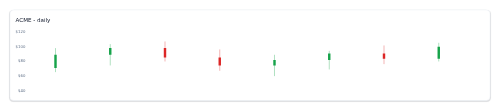
candlestick-shell A card-framed OHLC candlestick skeleton drawn from precomputed candle geometry.

capabilities-list A service checklist - an optional title over a list of capabilities, each with a success check and an optional note.

captions-toggle A CC on/off control with an optional language menu for video captions.

car-rental-card A rental vehicle card with specs (seats, transmission, bags) and daily price.
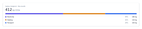
carbon-footprint A card showing total CO2e for a period with a stacked bar and legend breaking it down by source.
card-grid A responsive grid container that lays out any child cards with configurable columns.
card-rail A simple horizontal scroll rail of fixed-width cards.
card-slider A horizontal snap slider that holds any cards, with prev/next controls.
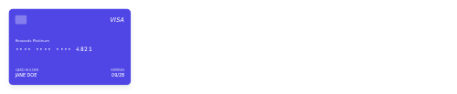
card-wallet A payment card visual with brand, masked number, holder, and expiry.
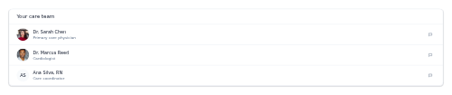
care-team-list A list of care-team providers with roles and a message action.
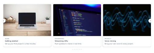
carousel-grid A highly configurable horizontal carousel of preview cards — cards-in-view per breakpoint, peek, looping, arrows and pager.

carrier-rate-card A selectable shipping-option card showing a carrier, service level, delivery estimate and price.

cart-drawer A slide-in cart panel with line items, subtotal, and checkout.

cart-line-item A cart row with image, variant, quantity stepper, price, and remove.

cashback-summary A cashback card with a big total, this-month and pending stats, and an optional category breakdown bar with legend.
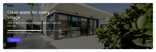
cause-hero A mission banner with a background photo, dark scrim, optional fundraising progress, and a donate CTA.
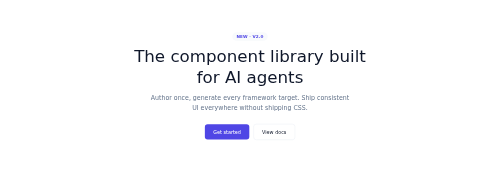
hero-centered A centered hero with an eyebrow, headline, subtext, and dual CTAs.

certificate-card A completion certificate with recipient, course, date, and credential ID.
challenge-card A fitness-challenge card with an optional cover image, meta row, and a join button that toggles to a joined state.

challenge-progress A reward-challenge card with a title, a progress bar toward a target, and a reward badge.

changelog-entry A single version changelog entry - a version pill, date, and a colour-tagged list of changes.

channel-header A channel banner with avatar, name, subscriber stats, and a subscribe toggle.

chart-legend A standalone legend of colour swatches with labels and optional values, laid out in a row or a column, for pairing with any chart shell.

chart-tooltip A small floating card that shows a hovered data point's category and its series values, for a chart library to position on hover.

chat-composer A message input for AI chat with an auto-growing textarea, attach button, and empty-guarded send.
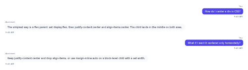
chat-thread A conversation transcript of user and assistant messages as aligned, colour-coded bubbles.
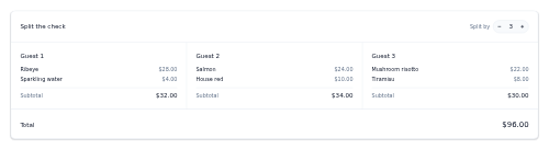
check-split A bill-splitting card with a column per guest, per-guest subtotals, a grand total, and split-by controls.

check-in-stepper An online check-in progress stepper with the current step's title and help.

form-field-checkbox A checkbox with a label and optional help text.
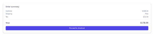
checkout-summary An order summary with line items, totals, taxes, and a checkout CTA.

chef-card A chef profile with photo, specialty, and a short bio.

chip A compact selectable chip with an optional leading avatar or icon.
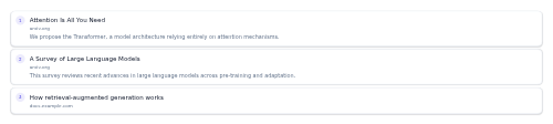
citation-list A numbered list of source citations backing an AI answer, each linking out with an optional snippet.
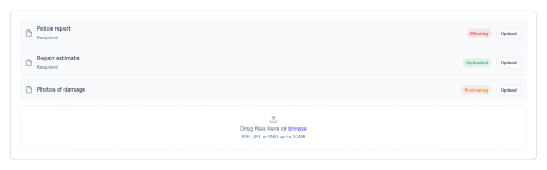
claim-document-upload A checklist of the documents a claim requires, each with a status badge and upload action, plus a dashed dropzone.
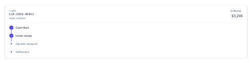
claim-status A claim summary card with a monospace claim number, status pill, amount and a vertical progress timeline.

client-marquee A continuously auto-scrolling strip of muted client logos that pauses on hover and respects reduced motion.
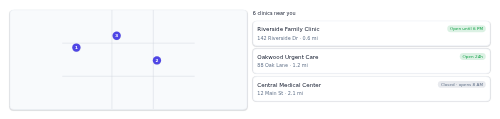
clinic-locator A map + clinic list panel with open/closed status and distance.
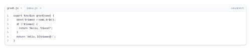
code-editor-shell A read-only editor chrome with file tabs and a numbered gutter for displaying source code.

code-sample-tabs A tabbed multi-language code block - switch languages with an ARIA tablist and copy the active sample with one click.
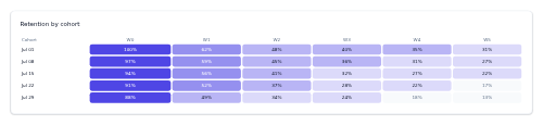
cohort-heatmap A retention cohort table shaded by value, cohorts as rows and weeks as columns.
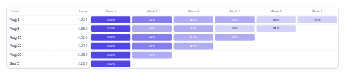
cohort-table A retention cohort grid with a heatmap of per-period retention.
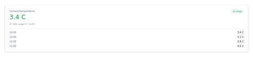
cold-chain-monitor A temperature-monitoring card showing the current reading against a safe range with a recent-readings log.

color-swatch-row Selectable garment color swatches with names and sold-out states.

color-picker-input A colour field pairing a native swatch, a hex text input and optional quick-pick preset swatches, kept in sync.
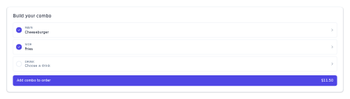
combo-builder A build-your-meal selector with steps for main, side, and drink.

combobox A typeahead select whose text input filters a keyboard-navigable listbox of options.

command-palette A searchable command launcher (⌘K) that filters grouped commands as you type.

comment-item A comment with avatar, author, timestamp, body, like/reply actions, and nested replies.
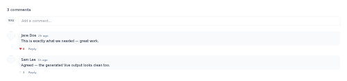
comment-thread A comment section with a count, an optional composer, and a list of comments.
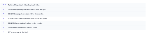
commentary-feed A live text-commentary stream with minute stamps and highlighted key moments.

company-account-card An at-a-glance CRM account card with logo, industry, a size/revenue/open-deals stat row, and the account owner.

company-culture-card A perks/values grid showcasing what it's like to work somewhere.
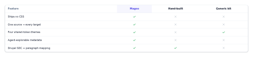
comparison-table A yes/no feature comparison matrix across options, with a highlighted column.
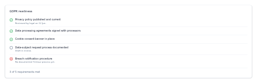
compliance-checklist A card listing compliance requirements, each marked done, pending, or failed, with an optional summary count.
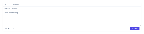
compose-email A message composer card with To and Subject fields, a body editor, a format toolbar and a Send button.

concert-card A tour date row with a date block, venue/city, and a tickets action.

confirm-dialog A compact yes/no dialog for confirming an action, with a destructive variant.

consent-checkbox-legal A checkbox with an agreement statement and an optional inline link to a policy, for capturing legal consent in a form.
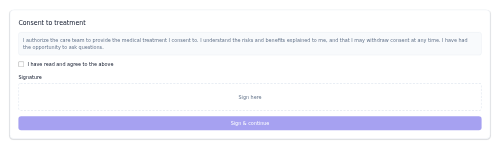
consent-form A consent panel with scrollable terms, an agree checkbox, and a signature area.
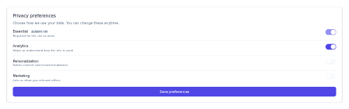
consent-preferences A privacy-consent panel with per-category toggles and locked essentials.

contact-card A person card with avatar, name, role, company, and email or phone action buttons.
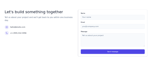
contact-hero A two-column contact call to action - heading, subheading and details on the left, a simple contact form on the right.

contact-list-row A single CRM contact row showing avatar, name, company, last-touch time, and a relationship-status pill.
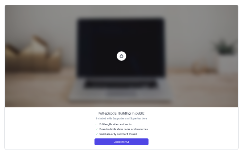
content-paywall A locked-content card with a blurred preview, a lock badge, benefits, and an unlock call to action.
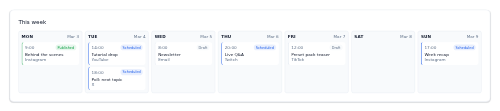
content-scheduler A week strip of day columns, each listing its scheduled, published, or draft post chips.

context-menu A right-click contextual menu that opens at the pointer over a target area.

controls-legend A key/button-to-action mapping legend.
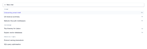
conversation-list A chat-history sidebar listing past conversations grouped by time, with a New chat button.
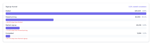
conversion-funnel-report A funnel with per-stage counts, rates, and step drop-off.

cookie-consent A bottom consent banner with accept, reject, and settings actions and a policy link.
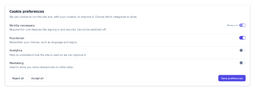
cookie-preferences A granular cookie-consent card with per-category toggle switches and Accept all / Reject all / Save controls.

coordinate-badge A monospace lat/long coordinate chip.

copy-to-clipboard A button that copies a value to the clipboard and briefly confirms with a "Copied!" state.

correction-notice An editorial correction note with a label and update date.

countdown-banner A promo banner with a live countdown timer to a deadline and a CTA.

coupon-input A promo-code entry with an apply button and success/error feedback.

card-course An online-course card with a thumbnail, instructor, lesson count, and progress bar.
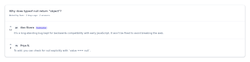
discussion-thread-edu A course Q&A thread with a question and voted answers, flagging instructors.
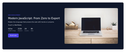
course-hero A course header with title, instructor, stats, and enroll, plus media.

course-progress A course progress card with percent complete and a continue-to-next action.
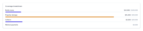
coverage-breakdown A card listing a policy's coverage lines with limits and an optional coloured usage bar per line.

coverage-toggle-row A row for adding or removing an insurance coverage, with a name, optional description and price, and a state switch.
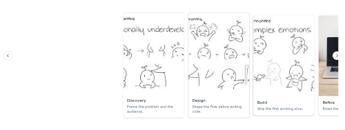
carousel-coverflow A center-stage carousel where the centred slide is full-size and emphasized while its neighbours scale down and dim.

credit-balance An account credits tile with balance, note, and add-credit.

credit-score-gauge A semicircle credit-score dial with the score, band, and range.
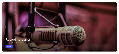
carousel-fade A full-width hero rotator that cross-fades between stacked slides with dots and arrows, pausing on hover or focus.
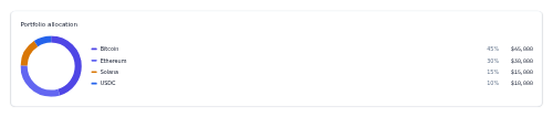
portfolio-allocation-crypto A donut chart of crypto holdings with a legend of label, percentage, and value.
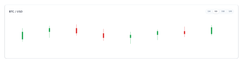
price-chart-crypto A candlestick price chart card with a segmented time-range selector.

csat-score A customer-satisfaction summary card with a headline score and a stacked satisfied/neutral/unsatisfied distribution bar.

cta-grid-images A CTA over a blurred image-grid backdrop tinted with the primary colour.
cta-offset-image A CTA band with an overlapping offset image on the trailing edge.

cuisine-filter A scrollable row of cuisine chips with icons for filtering restaurants.

currency-converter A currency converter with an amount, rate, and live converted result.
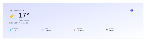
current-weather A current-conditions panel with temp, condition, and detail stats.
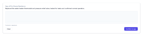
customer-signoff A sign-off card pairing a work summary with a signature canvas and Clear/Confirm controls.
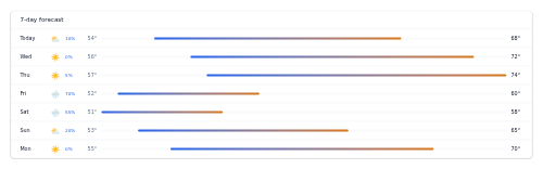
daily-forecast A 7-day forecast list with icons, precip, and temperature range bars.
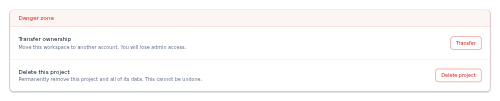
danger-zone A bordered block that groups destructive account or project actions behind clear, individually labelled danger buttons.
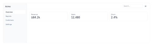
dashboard-shell A full app shell with a sidebar nav, a topbar, and a scrollable content area.

dashboard-toolbar A dashboard page header with a title, filter controls, and actions.

data-point-callout A small annotated marker that pairs a coloured dot with a labelled value, for highlighting a single point on a chart.

data-request-form A GDPR/DSAR form for a person to request access to, deletion, export, or correction of their data.

data-table A sortable data table with clickable column headers and hover rows.

date-range-picker A date-range selector with quick presets and the current range shown.

deal-card An opportunity summary card with value, stage, owner, and an optional win-probability bar.

deal-stage-progress A horizontal stepper showing a single deal's position through ordered pipeline stages.

dealer-card A dealership card with rating, address, open status, and call/directions.

deductible-meter A card showing progress toward a plan's deductible with an optional out-of-pocket maximum bar.

defect-log-row A single quality-defect entry showing the defect type, part, severity, station and time in a compact row.

defi-pool-row A liquidity-pool list row showing the pair, TVL, APR, optional volume, and an add-liquidity action.

definition-list A term/description key-value list.
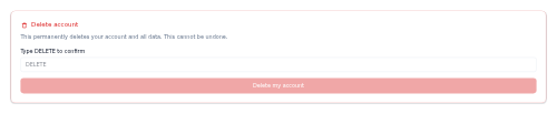
delete-account A danger-zone account deletion confirm gated by typing a confirm word.
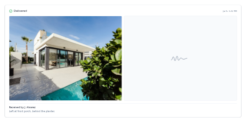
delivery-proof A proof-of-delivery card pairing a drop-off photo and captured signature with the recipient, time and courier note.
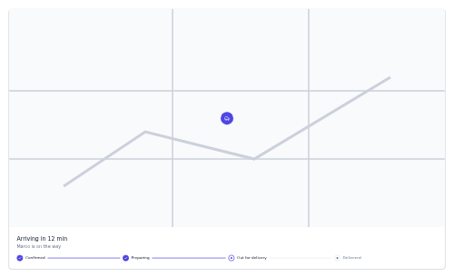
delivery-tracker An order delivery tracker with a map placeholder, ETA, and status steps.

demand-response-banner A tinted banner announcing a grid demand response event, with an urgency level, a reward, and opt in / opt out actions.

dependency-link A colour-coded pill marking a work item's dependency on another — blocks, blocked-by, or relates-to.
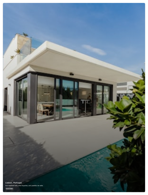
destination-card A tall image tile for a travel destination with a teaser and from-price.

device-group-card A grouped-device tile with a device icon, an on/total count, and a master on/off switch.

device-tile An on/off smart-home device tile with a switch, icon, name, room, and status line.

did-you-mean A spelling-suggestion line that promotes a corrected query and offers to search the original instead.

dietary-badges Colour-coded dietary tags (vegan, gluten-free, spicy) for menu items.

digital-product-card A sellable-download card with a cover, type badge, price, sales and rating, and a Buy button.
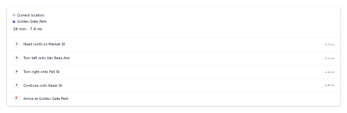
directions-panel A turn-by-turn directions list with origin, destination, and steps.

disclosure-accordion A stacked set of native expand/collapse disclosures for legal and policy text.

discount-banner A promo/coupon strip with a code and apply action.
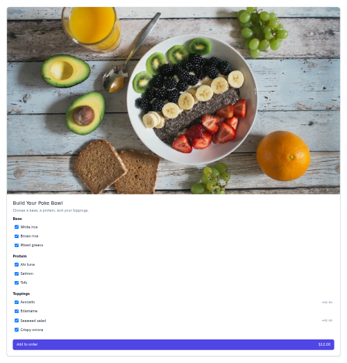
dish-detail A dish detail with photo, description, option groups, and add-to-order.
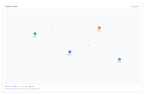
dispatch-map A schematic dispatch board facade that plots technician pins by status over a gridded map with a legend.

distance-slider A radius filter slider with a live value and result count.

dividend-row A dividend line - symbol and name, the dividend amount and frequency, the yield, and the ex-dividend and pay dates.

divider A horizontal or vertical rule with an optional centered label.

dock A macOS-style floating app dock whose icons lift and reveal a tooltip on hover, with a dot marking the active app.

dock-schedule A grid of dock doors by time slot, each cell tinted by whether the slot is free, booked or loading.

doctor-card A provider card with photo, specialty, rating, next availability, and book.

donation-amount-picker A grid of preset donation amount buttons with single selection and an optional custom amount.
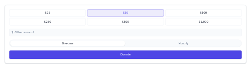
donation-form A donation panel with preset amount buttons, a custom amount, a one-time/monthly toggle, and a Donate button.
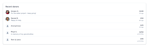
donor-wall A card listing recent donors with avatars, names, optional messages, amounts, and times.

donut-chart-card A donut/pie breakdown widget with a center value and a legend.
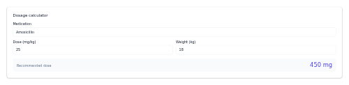
dosage-calculator A weight-based dose calculator that computes mg from mg/kg × weight.
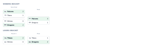
bracket-double-elim A double-elimination bracket with separate winners and losers paths.

card-download A file download row with a file-type icon, name, size, and a download button.

downtime-tracker A card breaking a period's total machine downtime into its reasons with a stacked proportion bar and a legend.

drawer A slide-in panel anchored to a screen edge, dismissed by backdrop/close/Escape.

menu-dropdown A click-to-open dropdown menu of actions with dividers and destructive-item styling.

dropdown-menu An actionable menu opened from any slotted trigger, with keyboard navigation.

navbar-dropdown A primary site header whose top links open dropdowns, and whose dropdown items open a third-level side flyout.

duration-badge A small overlay badge showing a video's length, typically pinned to a thumbnail corner.

e-ticket A digital event ticket with details and a scannable QR stub.

earnings-calendar-row A single earnings-calendar entry - ticker, report date, time-of-day chip, EPS estimate, and a confirmed or estimated tag.

election-result-card A vote-tally card with candidate bars, percentages, and a projected winner.
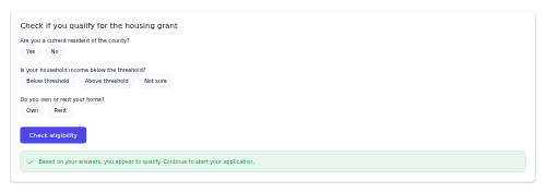
eligibility-checker A short qualifying questionnaire with choice-button questions, a check button, and a success or warning result banner.
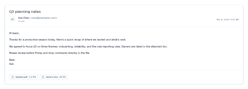
email-reader A full message view with subject heading, sender row, HTML body and an attachments strip.

email-row A single inbox line showing sender, subject, snippet, time, plus star and unread state.

email-sequence-step A single step in a sales email cadence, showing its order, subject, send delay, and delivery status.

email-verify-banner A verify-your-email prompt with a resend action.

emoji-reaction-survey A row of big emoji faces for capturing a quick sentiment reaction to a question.

employee-card A compact profile card with an avatar, name, title, department, location and an availability status pill.

empty-inbox A no-messages empty state with a positive tone and optional CTA.

empty-state A no-content placeholder with an illustration, message, and optional call to action.

endpoint-row A single REST endpoint line - colour-coded method pill, monospace path, and a short summary - for API reference lists.
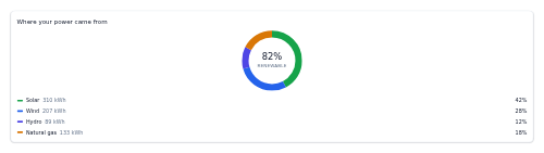
energy-mix-donut A tokenized SVG donut that breaks down where a home or grid's electricity came from, with a renewable share in the center.

energy-usage-meter A live power-usage card showing current watts, a usage bar, and today's energy and cost.

engagement-stat A creator metric tile with a value, a directional change, and an optional sparkline.
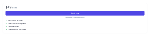
enrollment-cta A course enrollment panel with price, perks, and an enroll button.

epic-progress A card showing an epic's name, its stories-done count, and a completion bar.

equalizer-panel A graphic equalizer with per-band vertical sliders and presets.

equipment-card A serviced-asset card showing an equipment's name, model, serial, install date, warranty status and last service.
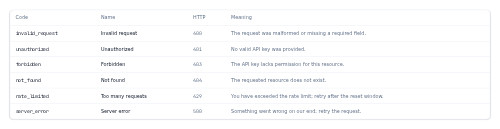
error-code-table A reference table of API error codes - code, name, HTTP status and what each one means.
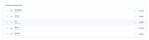
leaderboard-esports A ranked players/teams leaderboard with points, wins, and rank deltas.
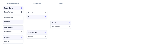
tournament-bracket-esports A single-elimination bracket with rounds, match scores, and winners.

eta-badge A small pill showing an estimated arrival with a clock icon, colour-coded by delivery health.

ev-charging-status A card showing an EV charge session - battery state of charge, status, power, time remaining, and range added.

ev-range-meter An electric-vehicle range readout with a battery charge gauge.

card-event An event card with a prominent date block, title, time, venue, and a CTA.

countdown-event A large day/hour/minute/second countdown to an event start.

event-hero An event banner with title, date, venue, and a get-tickets CTA over an image.

event-quick-create An inline new-event popover with title, time, and color.
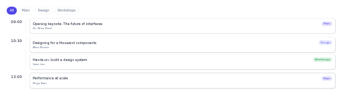
event-schedule An agenda by time with track filters and parallel sessions per slot.

exercise-row A single exercise line in a workout list — a done toggle, name, sets by reps and optional weight.
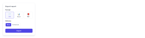
export-panel A format + schedule export popover with a run action.

fabric-detail A garment material composition and care instructions panel.
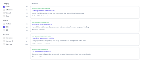
faceted-results A search results layout with a facet-filter sidebar beside a column of result cards.
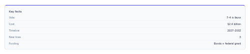
fact-box A key-facts sidebar with label/value pairs.

faq-accordion An expandable FAQ list where each question toggles its answer.

feature-grid A responsive grid of icon-badged feature cards that reflows from one to four columns.
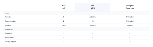
feature-matrix A plans × features comparison grid grouped by category.

feature-tour-tooltip A guided coachmark with step, message, and next/skip.

featured-lead-grid A news/blog homepage layout with one large lead story spanning two columns and two rows beside a grid of smaller stories.

feed-post A social post with author, body, optional media, and like/comment/share actions.

feedback-thumbs A compact thumbs up/down control for rating an AI response, with a toggleable selected state.

feedback-widget A floating launcher button that opens a small panel to rate and send written feedback.
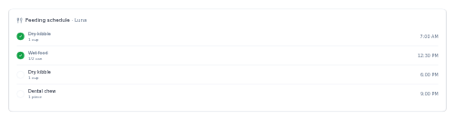
feeding-schedule A pet meals card listing each feeding time with its food and amount, and a tap-to-check fed toggle per meal.

figure-caption An image with a caption and optional credit line.

file-upload-dropzone A drag-and-drop file upload area with a browse fallback and a file list.

filter-bar A horizontal row of toggleable filter chips with a clear-all action.

filter-chip-row A horizontal row of removable active-filter pills with a "Clear all" button.
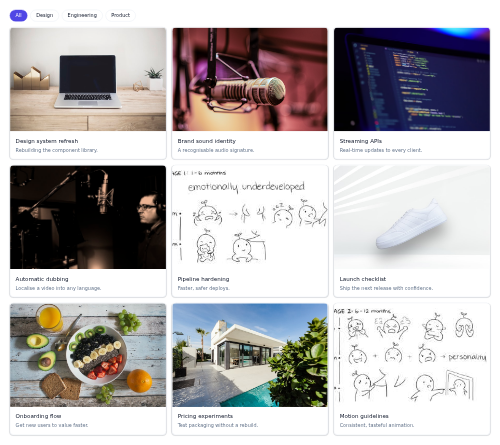
filter-grid A responsive card grid with a row of filter chips that show or hide cards by category.
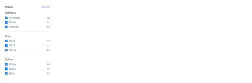
filter-sidebar A faceted filter sidebar with grouped checkboxes, counts, and clear-all.

fit-quiz-step A sizing/fit quiz question with selectable option cards.
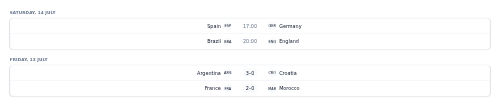
fixtures-list Fixtures grouped by date, showing kickoff times or final scores.

flashcard A flippable term/definition card for study and recall.

fleet-vehicle-card A vehicle status card for a fleet dashboard, showing driver, live state, location and fuel level.

flight-result-card A flight search result with airline, times, duration, stops, and price.

flight-search-summary A compact route/dates/passengers summary bar with an edit action.

floating-action-button A circular floating primary-action button, optionally expanding into a speed-dial of secondary actions.
floor-plan-viewer A floor-plan panel with a level toggle and room tags with areas.
fluid-grid A breakpoint-free responsive grid whose column count is derived from the available width and a chosen minimum card width.
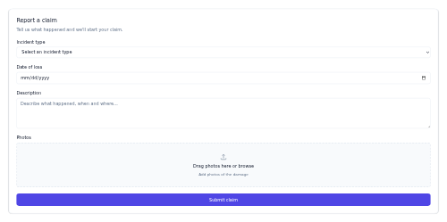
fnol-form A first-notice-of-loss form card - incident type, date of loss, description, photo dropzone and submit.
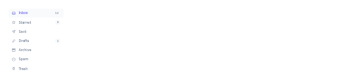
folder-nav A vertical mailbox folder list with per-folder icons and unread count badges.

follow-button A follow/unfollow toggle with an optional follower count.
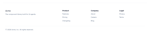
footer-columns A full site footer with a brand block, link columns, and a copyright line.

footer-nav A responsive multi-column grid of grouped footer links.

forgot-password A password-reset request form with email and a back-to-sign-in link.

form-validation-summary A grouped error summary linking to each invalid field.

tag-filter-forum A wrapping row of toggleable topic tag pills, each with an optional thread count, that filter a forum.

fraud-alert-banner A suspicious-activity notice with confirm and freeze-card actions.

menu-fullscreen A hamburger button that opens a full-screen overlay of large navigation links.

fundraiser-progress A goal thermometer card showing the amount raised, percent of goal, a progress bar, and an optional donor count.
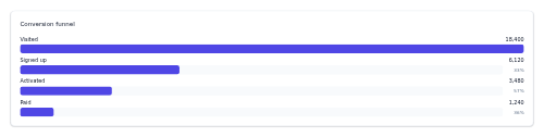
funnel-chart A conversion funnel with per-stage counts, bars, and step conversion rates.
game-card A store game card with cover, genre, rating, discount, and price.
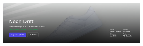
game-hero A game store hero with trailer/buy actions and a spec panel over key art.
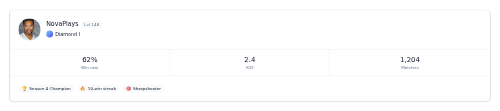
player-profile-game A player profile with rank, level, key stats, and earned badges.

rank-badge-game A tier emblem with a rank label and points (SR/MMR).

gantt-row A single timeline row with a coloured bar positioned by precomputed left and width percentages.

gas-fee-selector A segmented control of three gas-fee tiers (Slow, Normal, Fast), each showing its cost and estimated wait.

gauge A radial semicircle gauge for a single value against a threshold tone.

result-card-generic A single search result — optional thumbnail, breadcrumb URL, linked title, two-line snippet and a meta row.

genre-tile A colored genre card with a name and a decorative art corner.

geofence-toggle An area-alert setting with a title, radius, and on/off switch.
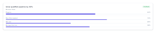
goal-okr-row An objective row with an owner, an overall progress bar and percentage, a status pill and optional key-result mini-bars.

goal-progress A widget of goals each with a current/target figure and a progress bar.
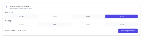
appointment-gov A booking card for an office visit with office details, a date-and-time-slot grid, and a Book button.
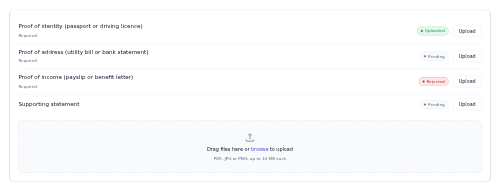
document-upload-gov A checklist of required documents, each with a status badge and an upload button, above a dashed dropzone.
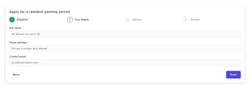
form-wizard-gov A multi-step official form with a numbered stepper header, a current-step field area, and Back/Next controls.
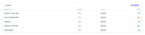
grade-table A gradebook table of assignments with weights, scores, and grades.

grid-status A card summarising the electricity grid's state - stable, strained, or outage - with frequency and load.
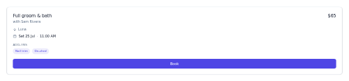
grooming-booking A pet grooming service card showing the service, groomer, date and time, add-on chips, price, and a Book button.

group-stage-grid A responsive overview grid of all groups with mini standings and qualification shading.
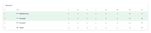
group-standings-table A group table with P, W, D, L, GF, GA, GD, Pts and qualification shading.

headcount-stat A headcount tile with a large count, a direction-coloured change, and an optional per-team breakdown row.

heading A single themed heading at a chosen level (1-6) with matching visual size.
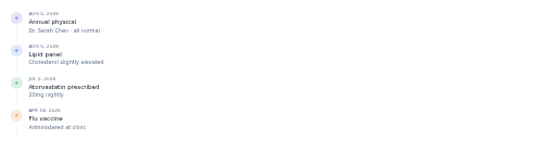
health-timeline A patient history timeline of visits, labs, prescriptions, and vaccines.

heart-rate-zone A card showing current bpm and zone plus a five-segment zone bar with the active zone raised and ringed.

heatmap-calendar A GitHub-style contribution heatmap of activity intensity over time.

holding-row A portfolio holding row with ticker, shares, value, and change.

timeline-horizontal A horizontal milestone timeline with done/upcoming markers.

hotel-result-card A hotel search result with photo, score, amenities, and price per night.

hourly-forecast A scrollable hourly forecast strip with icon, temp, and precip.

hub-status A smart-home hub tile showing online/offline state, paired-device count, offline count, and signal strength.

icon An inline SVG wrapper with a configurable size and optional accessible label.

button-icon An icon-only button with a required accessible label for screen readers.
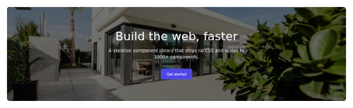
hero-image-bg A full-bleed background-image hero with a dark scrim and centered content.

image-compare A before/after image slider with a draggable, keyboard-accessible reveal handle.

image-generation-card A card for a single AI-generated image - the picture, its prompt, model and size, and quick actions.

image-lightbox A full-screen image viewer modal with previous/next navigation and captions.

impact-stat A bold "amount equals outcome" statement translating a donation into concrete impact.

in-app-message A dismissible in-app promo/announcement card with an optional image and CTA.
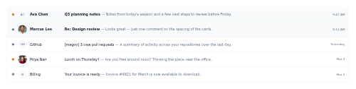
inbox-list A bordered, divided list of email rows with sender, subject, snippet, time, star and unread state.
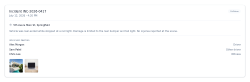
incident-report A detail card documenting an insurance incident - reference and date, location, narrative, involved parties, and photo thumbnails.

infinite-scroll-sentinel A load-more trigger that dispatches a loadmore event when it scrolls into view, with a spinner and an end-of-list state.

newsletter-inline An inline mid-article newsletter signup prompt with an email field.
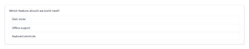
poll-inline A compact single-question poll that flips from clickable options to a results view with share bars.
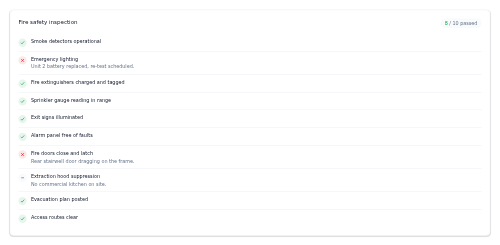
checklist-inspection A pass/fail/na inspection checklist card with a passed-of-total header and per-item result markers.

instructor-card An instructor profile with bio, rating, and teaching stats.

insurance-card A digital health insurance card with plan, member name, and member ID.
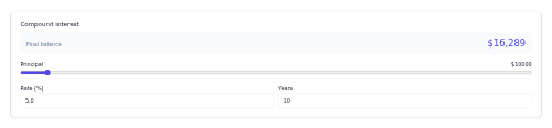
interest-calculator A compound-interest calculator with principal, rate, and term inputs.

interview-schedule A list of upcoming interviews with date/time, format, and a join action.

inventory-bin-row A stock-bin row showing a material, SKU, on-hand quantity, a fill bar against the reorder point, and its stock status.

invite-member An inline email-plus-role invite form that emits an event with the address and chosen role on submit.
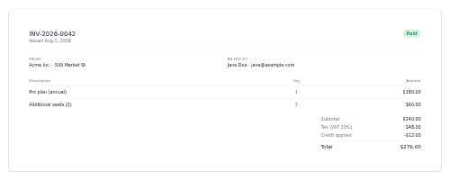
invoice-detail A full invoice with parties, line items, and totals.

invoice-row An invoice list row with number, date, amount, status, and download.
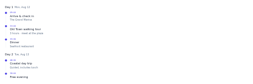
itinerary-timeline A day-by-day trip schedule with timed activities down a connecting line.

card-job A job listing card with title, company, location, salary, and tags.
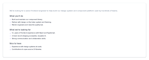
job-detail A job description with a summary and titled requirement/benefit sections.
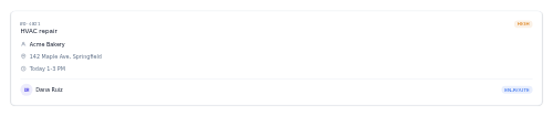
job-dispatch-card A compact work-order card summarising an assigned field-service job with priority, arrival window, technician and status.
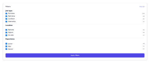
job-filter-panel A faceted filter sidebar for job search (type, location, experience).
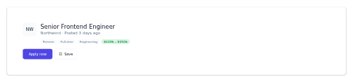
job-hero A job posting header with role, company, tags, salary, and apply/save.
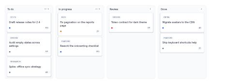
kanban-board A horizontal board of workflow columns, each stacking task mini-cards with a tag, priority dot, and assignee avatar.

kitchen-display A kitchen display board of open order tickets, each colour-coded by status so line cooks can read the pass at a glance.
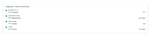
knockout-path A team's route through the knockout stage as a vertical timeline of ties.
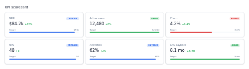
kpi-scorecard A grid of KPIs with value, target progress, and ahead/behind status.

kpi-tile A compact KPI tile with a label, value, and colored delta.

lab-result-row A lab test row with value, reference range, and a normal/high/low flag.

label-chip A small coloured pill that tags an email with a named label like Work, Personal or Urgent.

language-switcher A locale selector dropdown showing the current language and a menu of alternatives.

lead-score-badge A small pill marking a lead as hot, warm, or cold with an optional numeric score.

leaderboard-row A ranked leaderboard row with avatar, name, score, and a rank-change arrow.
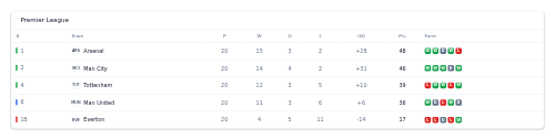
league-table A full standings table with a form guide and qualification-zone markers.
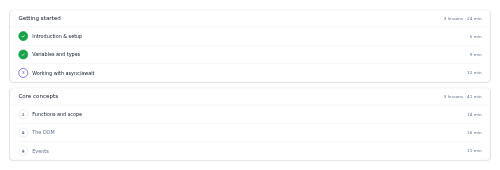
lesson-list A modular course curriculum with lessons and per-lesson progress.

lesson-row A lesson row with number, title, duration, and complete/current/locked state.

license-badge A small pill mark for a software license or compliance standard, optionally linking to its terms.

light-control A dimmable smart-light tile with a power switch, a brightness slider, and an optional colour swatch.
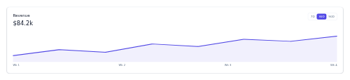
chart-card-line A line-chart widget with a headline value, period toggle, and a filled trend line.
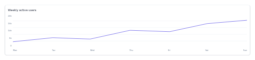
line-chart-shell A card-framed line-chart skeleton that draws a precomputed series path with axes and gridlines.
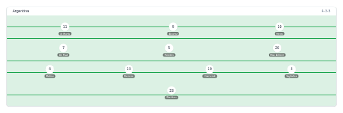
lineup-formation A pitch with players positioned by formation lines from goalkeeper to forwards.

lineup-poster A festival lineup poster with headliners and supporting acts.
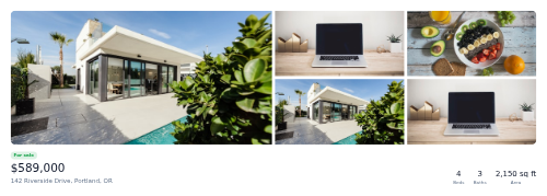
listing-hero A property listing hero with a photo gallery mosaic and key facts.

listing-status-badge A colour-coded status pill for a property listing (for sale, pending, sold…).

live-badge A pulsing red LIVE indicator for streams and real-time content.

live-blog-entry A timestamped live-blog update with an optional key-update flag.

match-card-live A live match card with a pulsing indicator, minute clock, score, and scorers.

live-score-ticker A horizontal strip of compact live scores with minute and a live indicator.
live-stream-chrome A stream player overlay frame with a LIVE badge, viewer count, streamer identity, a category chip, and a control-bar facade.
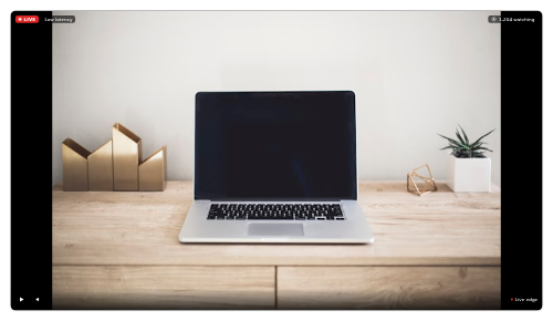
video-player-live A live-stream player with a pulsing LIVE badge, viewer count, and latency indicator.

load-board-row A freight load row showing origin, destination, equipment, weight, pickup date and rate with a Book action.
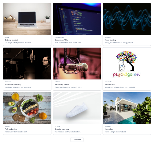
load-more-grid A responsive card grid that shows a first batch of items and reveals more, a step at a time, from a Load more button.

loading-overlay A translucent veil with a spinner that covers its container while content loads.
loading-skeleton-card A placeholder card with a shimmering media block and text lines.
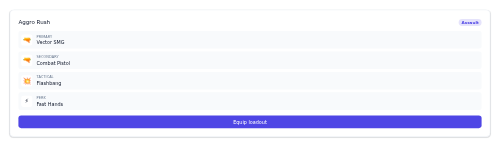
loadout-card A weapons/gear loadout summary with slots and an equip action.
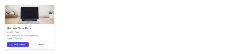
location-pin-card A map pin popup card with photo, rating, address, and directions/save.

lock-status A smart-lock tile showing locked or unlocked state with a colour-coded icon and a toggle button.
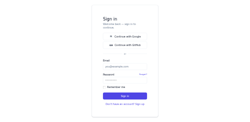
login-form A sign-in form with social providers, email/password, and remember me.

logo-cloud A grid or slider of partner/client logos (images or wordmarks) for social proof.
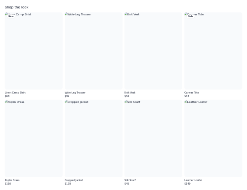
lookbook-grid An editorial outfit/product grid container for a lookbook.
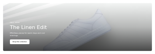
lookbook-hero A fashion campaign hero with an eyebrow, title, and shop CTA over an image.

loot-reveal A reward reveal card with a rarity glow, item, and equip/continue.
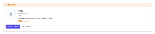
lost-pet-alert A high-visibility alert card for a missing pet, with photo, details, last-seen location, reward and contact actions.
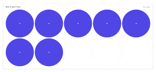
loyalty-stamp-card A punch-card style loyalty tracker with filled and empty stamps.
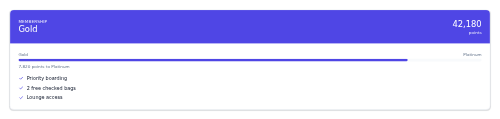
loyalty-tier-card A membership tier card with points, progress to the next tier, and perks.
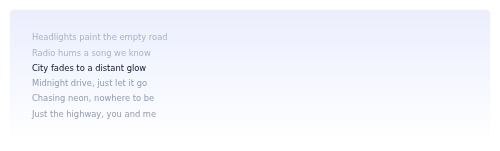
lyrics-panel A synced lyrics view highlighting the active line.

machine-status-tile A compact tile showing a machine's name, ID, live operating status and its OEE and uptime figures.

magic-link-sent A check-your-email confirmation for a passwordless sign-in link.

mailbox-folder A single mailbox folder row with an icon, label, and unread count badge.

maintenance-mode A down-for-maintenance page with an ETA and status link.

maintenance-schedule-row A single preventive-maintenance task row showing asset, task, due date, interval, technician and a status pill.

manifest-row A single line on a shipping manifest showing the item, SKU, quantity, weight and a colour-coded handling status.
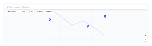
map-hero A full-bleed map shell with a search bar, category chips, pins, and zoom.

map-legend A symbol key for a map with dot/line/area swatches.
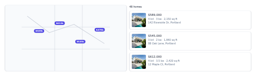
map-search-panel A split map + result list panel with price pins for property search.

map-list-toggle A two-button segmented control that switches search results between a list view and a map view.

margin-meter A margin-usage card showing buying power used as a tone-coloured progress bar with available and maintenance figures.

market-depth An order-book depth panel - two columns of bids and asks with price, size and precomputed depth bars.

marquee A continuously auto-scrolling horizontal loop of logos or text pills that pauses on hover and respects reduced motion.
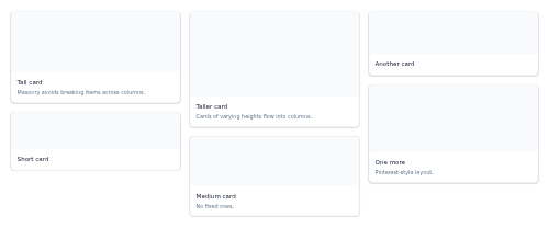
masonry-grid A Pinterest-style masonry column layout that holds cards of varying heights.
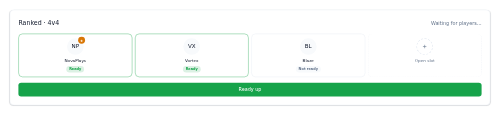
match-lobby A pre-match lobby showing players' ready-state, host, and open slots.

match-card-result A finished-match card showing the final score with the winner emphasized.
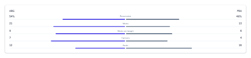
match-stats-panel A head-to-head match statistics panel with comparison bars.

match-timeline A goals/cards/subs event timeline with home and away events on either side of a center line.

matchday-selector A horizontal date/round selector for switching between matchdays.
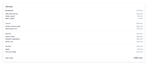
meal-plan-day A day's meals broken into food items with per-meal and whole-day calorie totals.

media-gallery A thumbnail strip with a large active preview that swaps on thumbnail click.
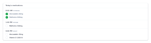
medication-schedule A daily dose timeline grouped by time of day with taken/pending states.
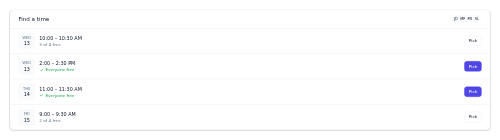
meeting-scheduler A propose-and-confirm time picker showing when everyone is free.

navbar-mega A navbar variant where primary links can reveal a grouped mega-menu dropdown panel.
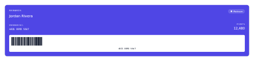
member-card A digital loyalty membership card with the member's name, number, tier, and a scannable barcode facade.

membership-perks A tier card listing membership perks with included checks and excluded crossed-out rows.

mention-item An @mention notification showing who mentioned you, where, and a context snippet.

menu-item-row A menu dish row with name, description, price, dietary tags, and image.
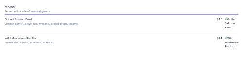
menu-section A titled menu section grouping menu-item rows under a heading.
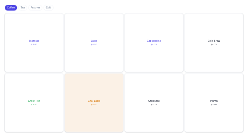
menu-tile-grid A grid of tappable POS menu buttons, each showing an item name and price with an optional colour tint.

menubar A desktop application menu bar whose top-level items each open a dropdown of actions with optional shortcuts and dividers.
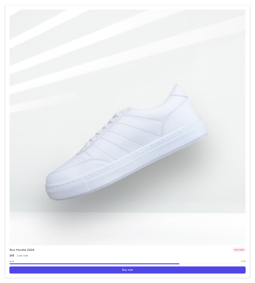
merch-drop-card A merch release card with a product image, price, an optional sold-through bar, a status badge, and a buy or notify button.

message-bubble A chat message bubble aligned by sent/received with a timestamp.

meter-reading-row A compact list row for a single utility meter reading with its ID, type, value, date, and change.

metric-comparison A metric card comparing the current value to a previous period.

metric-tile A dashboard metric tile with an icon, value, and colored trend delta.
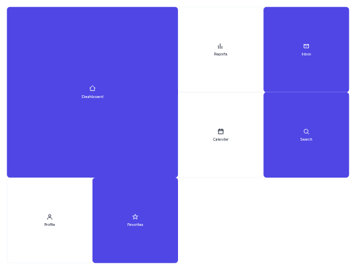
metro-grid A grid of uniform square tiles with optional 2x2 feature tiles, for a metro or app-launcher layout.

mileage-badge An odometer or efficiency pill for a vehicle.

milestone-marker A small dated milestone chip with a diamond icon coloured by status - done, upcoming, or missed.

mini-calendar A compact month picker with today, selected, and event dots.

mini-player A compact player widget with cover, title, progress, and play/pause.
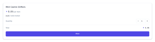
mint-widget A minting panel with a quantity stepper, live total, supply progress, and a mint button.

modal A centered dialog with a backdrop, header, body, and footer, dismissed by backdrop/close/Escape.

model-info A small "model wears size" fit note for a product photo.

model-picker A dropdown for choosing which AI model handles a conversation, with per-model descriptions and badges.

moderator-tools A compact moderation toolbar of labelled action buttons (Pin, Lock, Move, Remove) that dispatch events.
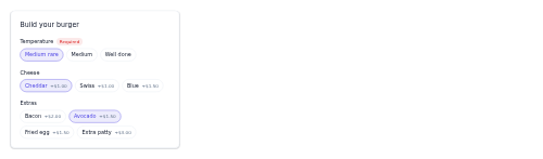
modifier-picker A card of grouped, selectable option chips for customising a menu item with modifiers.
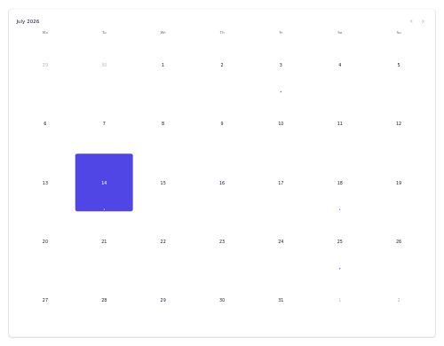
calendar-month A month grid calendar with weekday headers, today, and event dots.
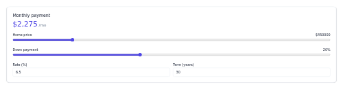
mortgage-calculator A live mortgage calculator with price, down payment, rate, and term inputs.
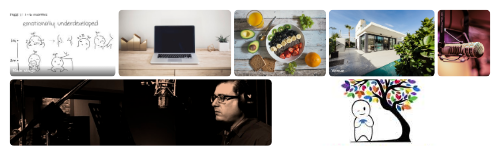
mosaic-gallery A row-justified image gallery whose tiles of varying aspect ratio flush-fill each row at a uniform height.
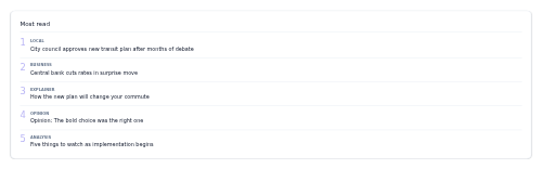
most-read-list A ranked list of popular stories with big rank numbers.
card-movie A movie poster card with rating badge, title, year, runtime, and genre chips.
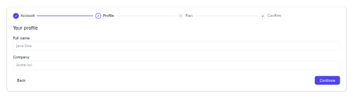
multi-step-form A wizard form with a step indicator, a current-step panel, and back/continue.

navbar A site header with a logo, primary links, trailing actions, and a mobile toggle.

nav-rail An icon-only vertical app rail that expands to reveal labels on hover or focus.
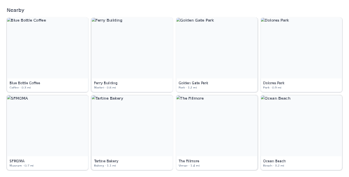
nearby-grid A responsive grid container for nearby place cards.
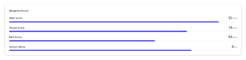
neighborhood-stats Walk/transit/bike/school scores for a property's neighborhood, with bars.

network-switcher A chain-select dropdown - a trigger showing the active network and a menu of chains with a check on the current one.

card-news A horizontal news item with a thumbnail, category, timestamp, and headline.

quote-card-news A pull quote with an attributed source and role.

newsletter-signup A centered email capture block with title, description, field, and fine print.
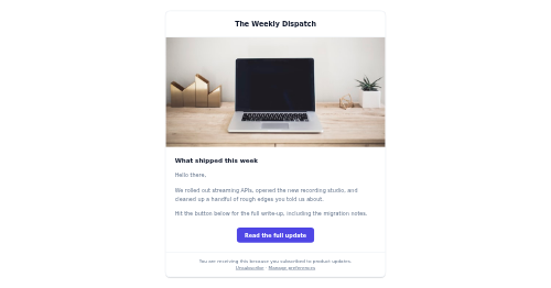
newsletter-template A centered, email-width content block with a header, hero, body, CTA, and footer.

nft-card A card that lists a single NFT with its artwork, name, collection, and price.
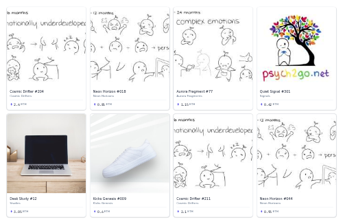
nft-gallery A responsive grid of NFT tiles, each showing artwork, name, collection, and price.

no-results A search empty state with the query, guidance, and suggestions.

no-results-suggestions An empty-search state that echoes the failed query and offers alternative searches plus optional tips.

note-composer A compact quick-note input for CRM timelines, with mention and attach affordances and a Save action.

notification-badge An unread count (or dot) badge overlaid on the corner of an icon.

notification-banner A persistent full-width severity banner with an optional action and dismiss.
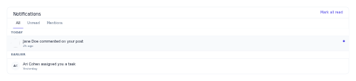
notification-center A full notifications panel with filter tabs, grouping, and mark-all-read.

notification-empty-state A "you're all caught up" placeholder shown when there are no notifications.

notification-group-header A small date/section header that groups rows within a notification list.

notification-inbox A dropdown/drawer panel listing notifications with an unread count and mark-all-read.

notification-list-item A notification row with an actor avatar, message, timestamp, and read/unread state.

notification-preferences A matrix of notification types against Email, Push, and SMS channels, each cell a toggle switch.

now-playing-bar A full playback bar with track, transport controls, and a seek progress.

nps-survey A Net Promoter Score survey with a 0-10 recommend scale and an optional follow-up reason.

nutrition-facts A compact calories and macros panel for a dish.
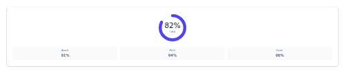
oee-gauge A radial gauge showing an overall equipment effectiveness percentage with its availability, performance and quality sub-metrics.

notice-banner-official A bordered public-notice strip with a seal icon, a title and message, and an optional action link, in info, warning, or alert levels.

offline-banner A no-connection notice with a retry action.
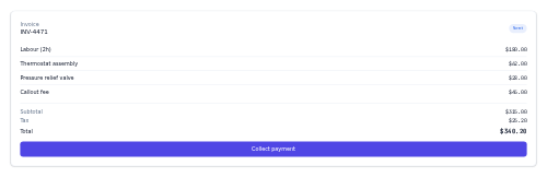
invoice-onsite A compact on-site invoice card with a status pill, line items, a totals block and a Collect payment button.
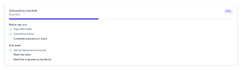
onboarding-checklist A grouped new-hire task checklist with a progress header and completed items shown checked and struck through.
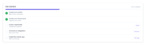
onboarding-checklist A setup task list with progress and per-task actions.
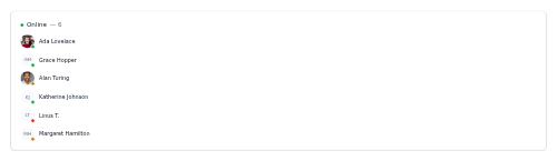
online-members A who's-online card listing members with avatars and a presence dot coloured by status.
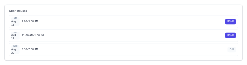
open-house-schedule A list of upcoming open-house viewing slots with RSVP and full states.

opinion-card A columnist opinion piece card with kicker, headline, and byline.

options-chain-row A single options-chain line - strike, bid and ask, volume and open interest in the mono face, tinted when in-the-money.
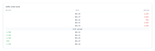
order-book-ladder A mono price ladder showing resting bid sizes on the left, ask sizes on the right, and a highlighted spread row in the middle.
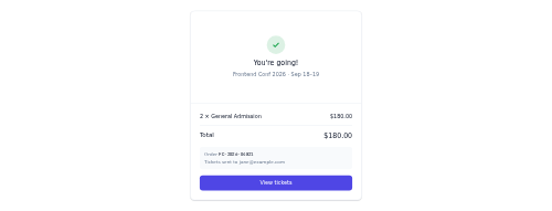
order-confirmation-ticket A ticket purchase confirmation with order lines, total, and view-tickets.

order-item-row An order line with quantity, item, modifiers, and price.

order-status-rail A horizontal rail of order pipeline stages - New, Preparing, Ready, Served - each with a live count and the current stage highlighted.
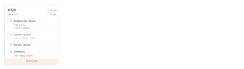
order-ticket A receipt-style kitchen ticket listing ordered items, their modifiers, and a kitchen status.
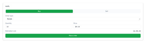
order-ticket-trade A buy/sell order ticket - a green/red side toggle, order-type select, quantity and price inputs, an estimated cost and a place-order button.

order-tracker A horizontal order-status stepper from placed to delivered.

org-chart-node A manager node with an avatar and a connected row of direct-report mini-cards, one branch of an org chart.

otp-input A one-time-code input with per-digit cells and auto-advance.
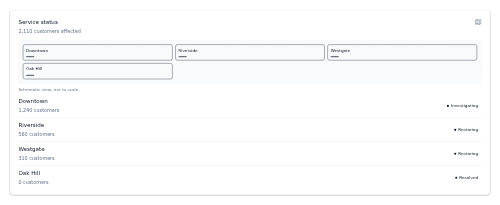
outage-map A card pairing a stylized schematic map facade of affected regions with an outage list, each coloured by restoration status.
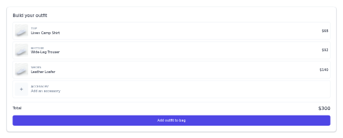
outfit-builder A mix-and-match outfit builder with slots, prices, and a running total.

card-overlay An image card with a gradient scrim and overlaid title, subtitle, and CTA.

package-status-row A compact one-line parcel summary with carrier, tracking number, a colour-coded status pill and an ETA.

pagination A page-number list with previous/next controls and "…" truncation for long ranges.
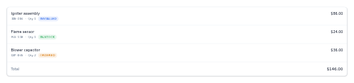
parts-list An itemised list of parts used on a job, with SKU, quantity, price, stock status and a total.

party-invite A squad invite prompt with accept/decline actions.

password-strength A password field with a strength meter and a live rules checklist.

patient-header A patient banner with identity, key facts, and allergy alerts.

payment-method-card A saved card row with brand, last-4, expiry, and edit/remove.

payment-terminal A card-reader terminal panel showing the charge amount and its state - tap or insert card, processing, approved or declined.
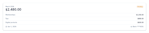
payout-summary A creator payout card breaking a period's earnings into revenue sources with a paid/pending status.
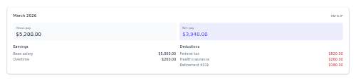
payslip-summary A pay-period card summarising gross and net pay with itemised earnings and deductions lists.

paywall-prompt A subscribe-to-read gate with a fade, offer, and subscribe/sign-in.

penalty-shootout A shootout tracker showing scored/missed kicks per team with the running score.
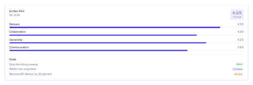
performance-review A review summary card with an overall rating, per-competency rating bars and a goals list with status pills.

period-comparison A this-vs-previous-period metric with a delta.
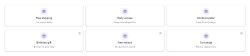
perks-grid A responsive grid of member perk tiles, each with an icon and label, where locked perks dim and show a lock badge.

permission-request A grant-access prompt with allow/deny actions.

pet-health-timeline A vertical care-history timeline for a pet, colour-coding each entry by type (vaccine, visit, med, note).
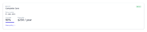
pet-insurance-card A summary card for a pet insurance policy, showing plan, status, policy number, coverage percentage and deductible.

medication-reminder-pet A card for a pet's medication with dosage, schedule, the next dose highlighted and a row of markable dose times.

pet-profile-card A compact pet summary card with a photo or paw glyph, name, breed, and a stat row for age, weight, and gender.

weight-tracker-pet A compact card showing a pet's latest weight, its change since last weigh-in, healthy range and a mini trend line.

petition-signer A petition card with a running signature count, optional goal progress, and a quick name/email sign form.
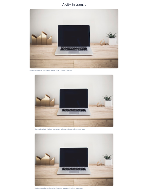
photo-essay A captioned image sequence for visual storytelling.
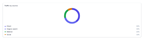
pie-chart-shell A tokenized SVG donut chart skeleton that renders from caller-precomputed slice geometry, with a legend.

pill-nav A pill-style segmented navigation where the active item sits raised on the surface.

pinned-post A highlighted, stuck-to-top forum post with a pin marker, title, author meta and optional excerpt.
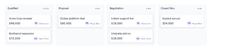
pipeline-board A horizontally scrolling kanban of deal stages, each column holding stacked deal mini-cards.

place-result-row A place search result with marker, rating, category, distance, and directions.
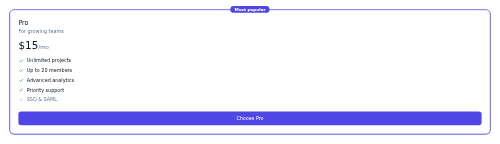
plan-column A single pricing plan column with price, features, and a CTA.

player-card A player card with squad number, position, nationality, and key stats.
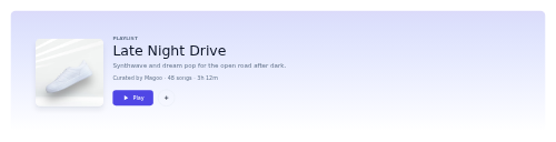
playlist-header A playlist hero with cover, title, description, meta, and play/save.
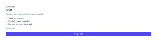
pledge-card A single pledge tier showing an amount, description, benefits checklist, backer count, and a confirm button.

card-podcast A podcast episode card with cover, meta, excerpt, and an inline audio player with scrub.

podcast-episode-row A podcast episode with cover, description, play button, and listen progress.

points-balance-card A card showing a loyalty member's points total, tier, and any points about to expire.

points-history-row A single ledger row for a points transaction - description, date, a signed delta coloured by direction, and a running balance.

policy-card A compact summary card for a single insurance policy - type, number, status pill and key terms.

policy-renewal-banner A tinted banner announcing an upcoming policy renewal with its date, days remaining, and a renew action, scaled by urgency.
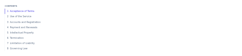
policy-toc A numbered, sticky contents list for a legal or policy document that tracks the current section on scroll.
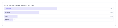
poll A vote poll with options and live result bars.
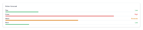
pollen-forecast Allergen pollen levels with per-allergen bars.

popover An anchored floating panel toggled from a trigger, for richer content than a tooltip.
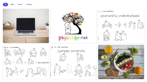
portfolio-grid A filterable grid of work tiles with a row of category chips that show or hide projects client-side.
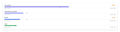
portfolio-rebalance A target-vs-actual allocation panel - per holding a bar of actual weight with a target marker and a drift pill when off-target.

portfolio-summary A portfolio total with today's change and an allocation bar + legend.
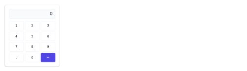
pos-keypad A numeric entry keypad with a readout and an Enter action for POS amount and quantity input.

position-card A holding summary card - symbol and shares, market value, a coloured profit/loss figure with percent, and average cost vs current price.
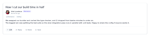
post-detail A full forum post card with the title, author identity, timestamp, rendered body, and a footer of vote, reply, share and save actions.

precipitation-chart Hourly rain-probability bars with percentages.
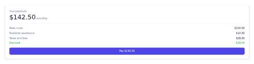
premium-summary A premium breakdown card showing the headline total, a line-item list, an optional discount, and a pay action.

prescription-card A medication card with dosage, refills, prescriber, and next refill.

presence-list A list of people with avatars and colored presence status dots.
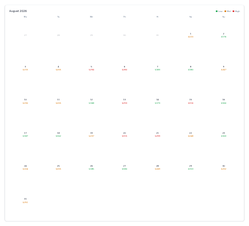
price-calendar A month grid showing the fare for each day, colour-coded by price band.
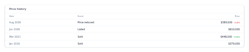
price-history A table of a property's price events (listed, reduced, sold) with changes.
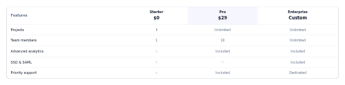
price-table A multi-tier feature comparison pricing table.

price-tag A formatted price display with an optional struck-through original price.

price-ticker-tape A continuously scrolling horizontal tape of market quotes (symbol, price, change) that pauses on hover and respects reduced motion.
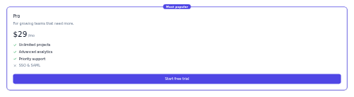
card-pricing A single pricing plan card with price, feature list, CTA, and a featured variant.
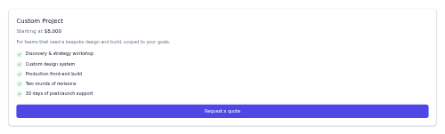
pricing-quote A request-a-quote card - title, optional starting price and description, an included-features checklist, and a primary CTA.
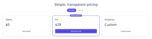
pricing-tiers A pricing section with a monthly/annual toggle and a row of plan cards.

pricing-toggle A monthly/annual billing switch with a savings note.

priority-flag A small flag icon and label that signals a task's priority level by colour.
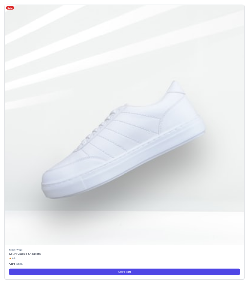
card-product An e-commerce product card with image, brand, price, rating, and add-to-cart.
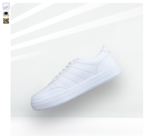
product-gallery A product image gallery with a main image and a thumbnail strip.
product-grid A responsive product listing grid (2→3→4 columns) for product cards.

product-quick-view A modal product preview with image, price, description, and add-to-cart.

production-line-status A horizontal view of a production line's stations, each a status-coloured node with its throughput, connected in sequence.

card-profile A centered person card with avatar, name, role, short bio, and social links.
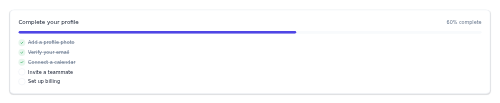
profile-completeness A setup-progress card showing a completion percentage over a bar and a checklist of done and remaining steps.
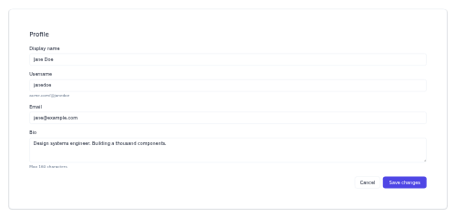
profile-settings An edit-profile form with fields, helper text, and save/cancel.

progress-bar A linear progress indicator with a value from 0-100 and an optional label.

progress-circle A circular/radial progress indicator with a centered percentage value.

progress-dots Step/carousel dots with an elongated active dot.
progress-photo A side-by-side before/after photo tile with labelled dates for tracking physical change.

progress-ring-stat A circular progress ring with a center percentage and a label/caption.

progress-steps A compact labeled multi-step progress indicator with connectors.
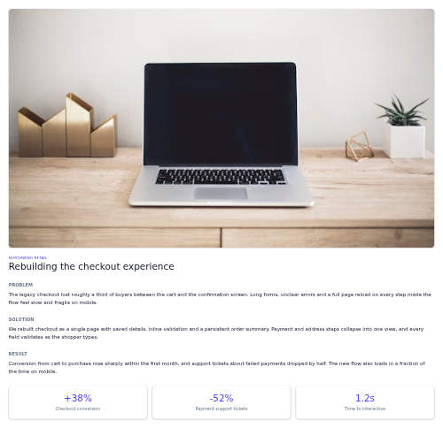
project-case-study A long-form case-study layout with a hero, a Problem/Solution/Result narrative, and an outcome metrics row.

project-health-card A card summarising a project's health status, a one-line note, and a few key metrics.

prompt-suggestions A wrapping row of starter-prompt chips that prefill an AI composer when clicked.
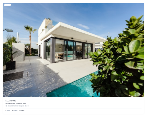
card-property A real-estate listing card with photo, price, location, and beds/baths/area specs.
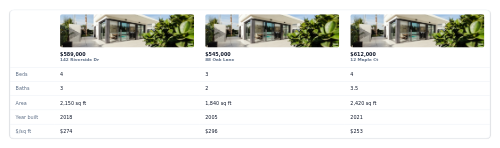
property-compare A side-by-side property comparison table with photo/price headers.

property-facts-grid A grid of key property facts (beds, baths, area, year) as icon tiles.

proration-notice A mid-cycle plan change note with a prorated charge breakdown.
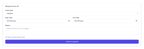
pto-request A leave-request form with a type select, start and end dates, a reason field and a balance note that emits a pto:request event.

public-record-row A list row for a public record — document icon, title and type, a mono date, an access badge, and a View or Request action.

pull-quote An emphasized inline quotation with an accent left border and optional citation.
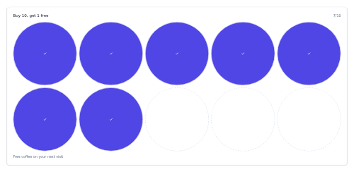
punch-card A stamp-card showing earned and remaining punches toward a reward.

push-optin-card A card prompting the user to enable browser/push notifications, with allow and dismiss.
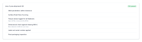
quality-control-checklist A card-framed QC inspection checklist where each step shows a pass, fail or pending result marker.

quest-card A quest/objective card with reward, progress, and reset timer.
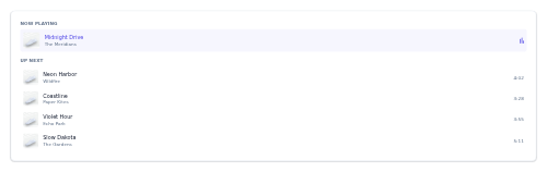
queue-list A playback queue showing now-playing and up-next tracks.
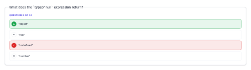
quiz-question A quiz question with lettered answer options and correct/wrong states.
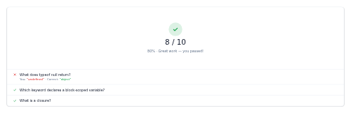
quiz-result A quiz score summary with pass/fail and a per-question answer review.
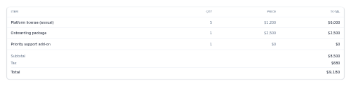
quote-builder A quote table of line items with a subtotal, optional tax, and grand total block.

card-quote A large decorative pull-quote card with an oversized quotation mark and attribution.
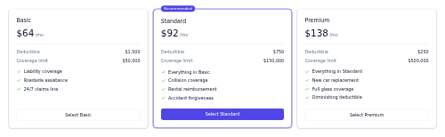
quote-comparison A responsive set of side-by-side insurance quote columns with premium, deductible, coverage and a feature list.
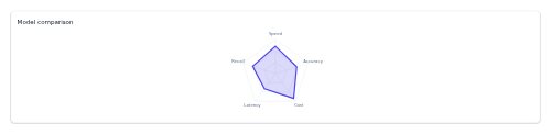
radar-chart-shell A tokenized SVG radar chart skeleton that renders a data polygon over a spoked grid from caller-precomputed geometry,.

form-field-radio-group A group of radio options as selectable cards with descriptions.

range-facet A min/max range filter with a visual selected-segment track, two draggable-looking handles and numeric min/max inputs.

range-slider A labeled range slider with a live value readout.

rate-limit-meter A compact meter showing API calls used against a quota, with a coloured fill bar and reset time.

rating-prompt A compact card that asks users to rate an experience on an interactive star row.

rating-slider A range slider with a floating value bubble above the thumb for score, rating and NPS-style inputs.

reaction-bar An emoji reaction selector with per-emoji counts and an add-reaction control.

read-receipt A tiny check-mark indicator showing whether a message was sent, delivered, or read.

reading-percent A fixed corner badge showing the percent of an article read, between a start and finish marker.

reading-progress A top scroll progress bar that fills as the reader moves through an article.

realtime-counter A live active-users number with a pulse and a mini activity spark.

recent-searches A history block of recent-query chips, each with a clock icon and remove button, plus a clear-all action.
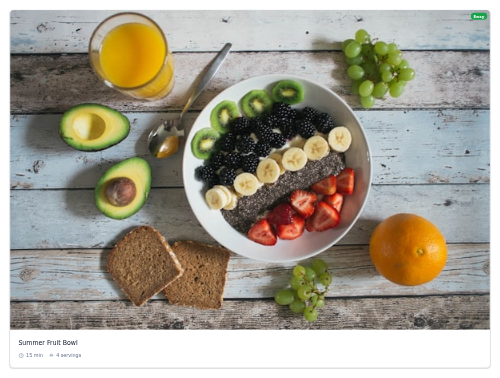
card-recipe A recipe card with a photo, prep time, servings, and a difficulty badge.

recurring-donation-toggle A pill segmented control that switches a gift between one-time and monthly, with an optional recurring-impact note.
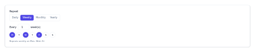
recurring-rule A repeat-frequency builder with interval and weekday selection.

redemption-row A single loyalty redemption entry - reward, date, points spent, and status.
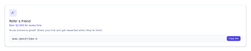
referral-card A refer-a-friend widget with a reward and a copyable referral link.

referral-invite A card inviting a member to share a referral code for a bonus, with one-click copy.
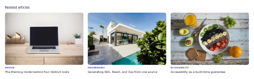
related-articles A grid of related posts with image, category, and title.

related-products-rail A horizontal, scrollable rail of recommended products.
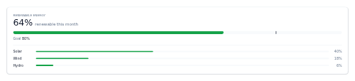
renewable-goal A card showing the current renewable share of energy against a target, with a goal marker and an optional source breakdown.

rep-counter A tap-to-count card with a big count display, a large +1 button, and a reset, with an optional target cap.

reply-composer A compact reply editor — an avatar beside a bordered field with a small formatting toolbar and a primary Reply button.
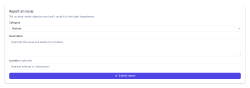
feedback-gov A compact report-an-issue form — category select, description textarea, optional location, and a submit button that dispatches the report.

report-filter-bar A dimensions/measures filter bar with active-filter chips.

report-header A report masthead with title, date-range switch, and export.
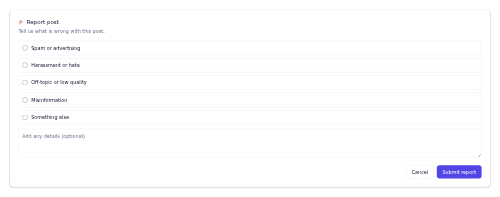
report-post A flag-content form with a radio list of reasons, an optional details field and submit/cancel actions.

representative-card A profile card for an elected official — photo or initials, office and district, party pill, and a row of contact icon buttons.
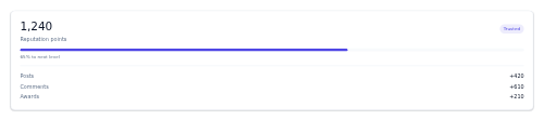
reputation-card A karma summary tile showing a member's points, level, progress to the next level and a points breakdown.
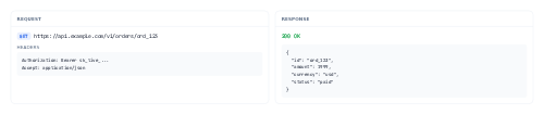
request-response-viewer Side-by-side request and response panes for an HTTP call - method pill, URL, headers/body, and a colour-toned status line.
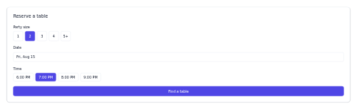
reservation-widget A table-booking widget with party size, date, and time selection.
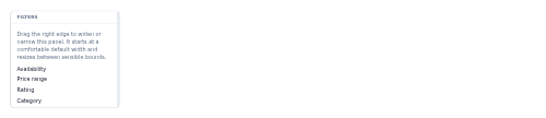
resizable-panel A panel with a draggable edge handle that resizes its width or height.
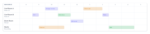
resource-timeline A per-resource booking timeline across the day.
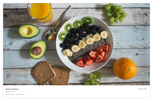
restaurant-card A restaurant card with cuisine, rating, and delivery time/fee.

restock-notify A notify-when-available email capture for an out-of-stock variant.

resume-upload A drag-drop resume uploader with a dropzone and an uploaded-file state.
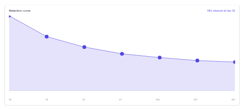
retention-curve A retention-over-time curve shell with a filled area and day labels.
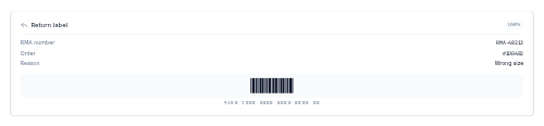
returns-label A dashed-border RMA label card with the return number, order and reason, a barcode facade and carrier.
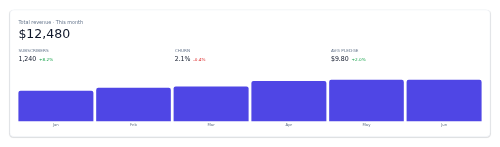
revenue-dashboard An earnings overview card with a headline total, a row of stats with coloured deltas, and an optional mini bar chart.

review-item A product review with a star rating, title, body, author, and verified badge.

review-score-badge A prominent review score with a qualitative label and review count.

review-summary An average rating with per-star breakdown bars and total review count.
reward-catalog-item A card for a redeemable loyalty reward with its image, points cost, and a Redeem button.
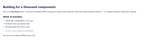
rich-text Renders a trusted blob of HTML as tokenized, themed body copy.

rich-text-toolbar A compact formatting toolbar of grouped icon buttons that emit format commands for a rich-text editor.

risk-assessment A card summarising an overall risk level with an optional score and a list of contributing factors, each with an impact chip.
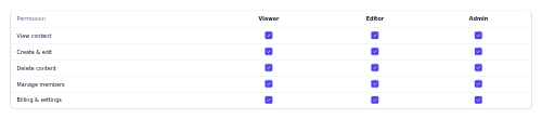
role-permissions A role-by-permission matrix of checkboxes.
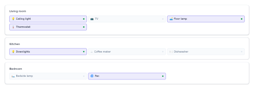
room-grid A room-by-room overview of smart devices, each room a card of device chips that highlight when on.
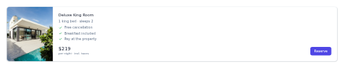
room-type-card A hotel room type with photo, beds, perks, and nightly rate.

route-map A stylized route facade showing numbered, connected stops on a schematic map panel with a distance and time summary.
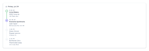
route-schedule A technician's day laid out as a vertical timeline of scheduled stops with per-stop status.

route-summary A route summary with time, distance, mode, and traffic, plus a start action.

rsvp-widget A going/maybe/no RSVP selector with an attendee count.

salary-range-badge A compensation range pill with period and an optional note.
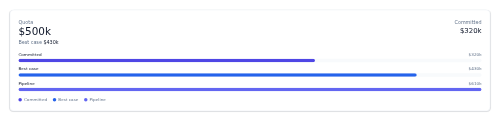
sales-forecast A quota-versus-pipeline card with headline figures and horizontal bars for committed, best-case, and pipeline.
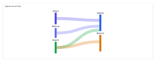
sankey-shell A tokenized SVG Sankey diagram skeleton that draws stage nodes and flow ribbons from caller-precomputed geometry,.

saved-filters A row of saved search-filter presets as toggleable pills, with a button to save the current query as a new preset.
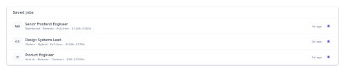
saved-jobs-list A list of bookmarked roles with company, tags, salary, and a remove action.

saved-search-alert A saved-search row with its criteria, new-match count, and a notify toggle.

savings-goal A savings goal with a progress ring, saved-of-target figures, and add-funds.
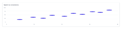
scatter-plot-shell A card-framed scatter-plot skeleton that dots precomputed x/y point positions with axes.

scene-card A tappable smart-home scene card that activates a group of devices at once.

schedule-timer A device automation tile showing on/off times, a weekday strip, and an enable switch.

scheduled-report-row A recurring report entry with schedule, format, and an enable toggle.
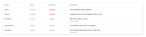
schema-table A parameters/fields reference table - name, type, required flag and description with optional defaults.
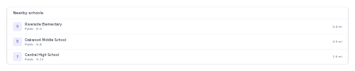
school-district-card A list of nearby schools with ratings, level, and distance.

score-header A big match header with both teams' crests, the scoreline, and status.

scroll-spy-nav A vertical section-tracking side nav whose active link follows the section currently in view.

sdk-install-card An install command with package-manager tabs (npm, pnpm, yarn, pip) and one-click copy.

search-autocomplete A search input with a filtered suggestions dropdown and keyboard navigation.

search-bar A search input with a leading icon and a clear button.

search-hero A prominent centered search block with a headline, large input and popular-query suggestion chips.

search-result-highlight An inline text span that highlights the matched search term within a result label using a marked run.

seat-course-timeline A horizontal coursing timeline - Appetizer to Entree to Dessert - with a status dot and dish hints for each course.
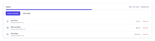
seat-management A team-seats panel with usage, add/invite, and a members list.
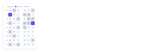
seat-map A selectable aircraft seat grid with available/selected/taken states.
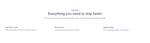
section-wrapper A padded page section with an eyebrow, heading, description, and content slot.
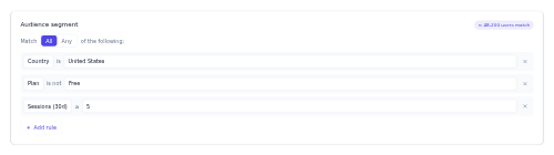
segment-builder An audience rule builder with match logic and a live size estimate.

segmented-control An iOS-style single-select switch of pill segments for toggling between a few mutually exclusive views.

form-field-select A labeled select dropdown field with help text.

select-setting-row A settings row pairing a label and help text with a native select of options.

sensor-alarm-banner A severity-tinted banner announcing a sensor reading that breached its threshold, with an acknowledge action.

sensor-reading A compact sensor tile showing a labelled value and unit, colour-coded by status.
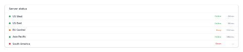
server-status-list A regional server list with ping and online/busy/down status.
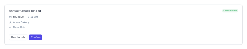
service-appointment A booking card for a scheduled service visit, with date, time window, technician and confirm or reschedule actions.

service-card A service or capability card with a tinted icon tile, a title, a short blurb, and an optional "Learn more" link.
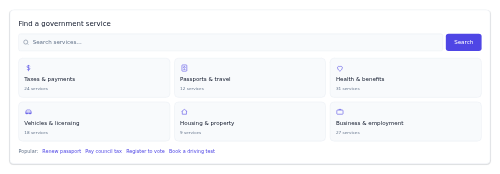
service-finder A find-a-service search panel with a prominent search bar, category tiles, and popular quick links.
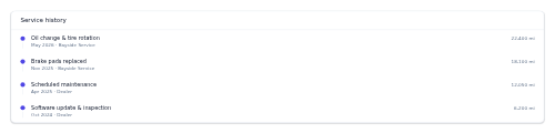
service-history A maintenance records timeline with date, mileage, and service.

session-card An agenda session with time, title, speaker, track, and room.
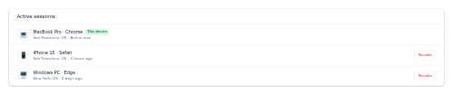
session-list A list of active device sessions with revoke actions.
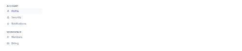
settings-nav A vertical, grouped navigation for the sections of a settings area, with an active highlight.
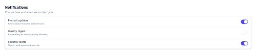
settings-section A titled settings group that wraps related setting rows in a bordered, divided card.

severe-alert-card A weather warning card with severity, detail, and expiry.
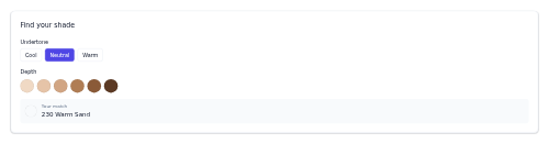
shade-finder A beauty shade matcher with undertone and depth selection plus a match card.

share-bar Social share buttons plus a copy-link action for an article.

share-menu A Share button that opens a popover of social share targets plus a Copy link action.
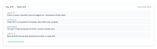
shift-handover A card summarising shift-to-shift handover notes, with flagged items highlighted and a sign-off footer.
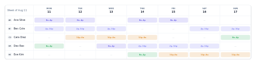
shift-planner A staff × days grid of work shifts.
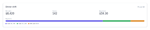
shift-report An end-of-shift sales summary card - a shift header, a grid of headline figures, and an optional payment-method breakdown bar with legend.
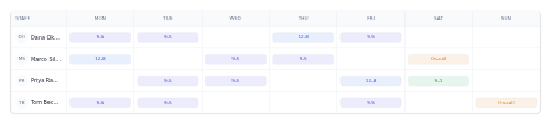
shift-schedule A weekly staff-by-day grid where each cell holds an optional coloured shift chip.
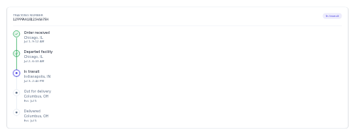
shipment-tracker A vertical stop-by-stop shipment timeline from origin scan to delivery, with a tracking number and status header.

showreel-embed A video reel block - a poster still with a dark overlay, a big centered play button, and an optional title and duration.

sidebar-layout A content + sidebar two-column responsive layout that stacks on mobile.
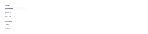
sidebar-nav A collapsible vertical navigation with grouped, headed sections of links.

signature-block An email signature with a name, role, and linked contact details beside an avatar.
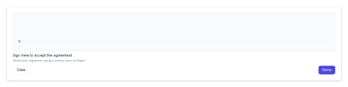
signature-pad A framed canvas field for drawing a signature with a mouse, pen or finger, with Clear and Done controls.
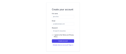
signup-form A registration form with fields, a terms checkbox, and a sign-in link.

cta-simple A headline + single CTA conversion band.

bracket-single-elim A single-elimination knockout bracket with rounds, matches, and winner highlight.
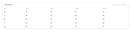
size-guide A measurement table mapping sizes to body/garment measurements.

size-selector Selectable size chips with sold-out states and a size-guide link.

skill-badge An earned skill token with an optional level.

skills-match-meter A fit-percentage ring with matched and missing skills for a job.
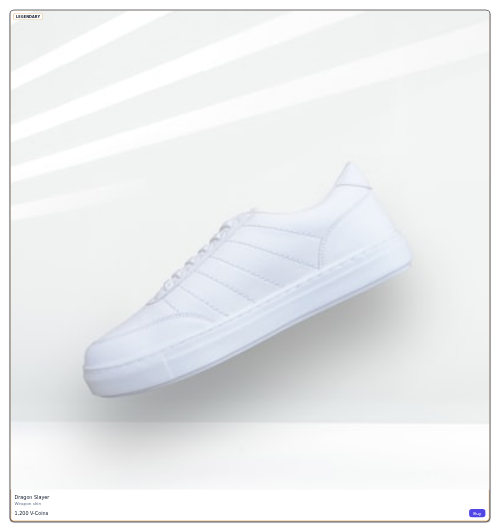
skin-item A cosmetic item card with rarity-colored border, price, and buy/owned state.

sla-timer An SLA countdown card showing time remaining and a fill bar coloured by on-track, at-risk or breached status.

sleep-summary A card showing total sleep with a stacked stage bar (deep, light, REM, awake) and a labelled legend.

sleep-timer A playback sleep timer with preset durations and a live countdown.

snackbar A brief bottom message with a single optional action, such as Undo.

snooze-menu A snooze-until dropdown listing preset times plus a custom "Pick date & time".

social-login-buttons Provider sign-in buttons (Google, Apple, GitHub) in a stack or row.
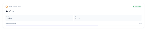
solar-production-card A single-panel card showing live solar output in kW with today's energy, peak, and self-consumption.

song-credits A writers/producers credits list for a track.

sort-and-view A results toolbar with a count, a native sort dropdown and a grid/list view toggle.

sort-dropdown A result-sorting selector with the current option shown and a checkable menu.

spacing-box An invisible wrapper that adds padding and margin around any component from a fixed set of choices.

sparkline-card A metric card with a value, delta, and an inline sparkline trend line.

speaker-card An event speaker card with photo, role, and their session.
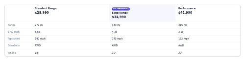
spec-comparison A trim-by-trim spec comparison table with a recommended column.

spending-breakdown A category spending donut with a total and a legend of amounts and shares.

spinner A rotating loading spinner with a configurable size and accessible label.

split-button A primary action button with an attached caret that opens a menu of related actions.
hero-split A two-column hero with text on one side and media on the other.
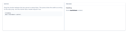
split-pane A resizable two-pane layout with a draggable divider between a start and an end pane.
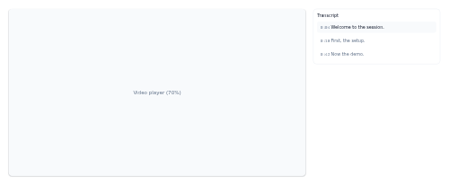
split-view A two-pane layout with a variable width split that stacks top/bottom on mobile.

sponsor-wall Tiered sponsor logos (platinum/gold/silver) as wordmarks.

sponsorship-card A brand-deal card showing the sponsor, campaign, deal value, a status pill, and a deliverables count.

sprint-header A sprint summary bar showing the sprint name, date range, story-point progress, and days remaining.
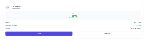
staking-card A card summarizing a staking position - APY, staked amount, rewards, and stake/unstake actions.

rating-stars A star rating display with a configurable max and value, and a filled/empty state per star.

star-rating-input An interactive star rating control with hover preview and full keyboard support.

card-stat A single-metric card with a big value and a colored trend delta.

stat-card A single-metric tile showing a value, its label, and a period-over-period change.

statement-row A statement period row with closing balance and a download action.

stats-band A responsive band that lays out a row of stat cards under an optional heading.

status-indicator A colored status dot with an optional label for presence (online/away/busy/offline).

status-service-row A single service status row - a coloured status dot, the service name, and optional uptime.

stepper A multi-step progress indicator with complete, current, and upcoming step states.

sticky-header A scroll-aware sticky header that gains a shadow once the page scrolls.
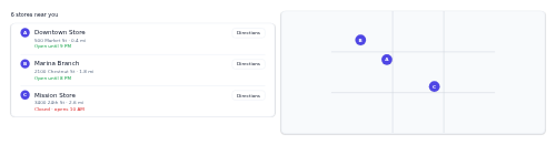
store-locator A map + store list locator with markers, hours, and directions.

story-list-item A news list row with category, time, headline, and a thumbnail.

streak-card A day-streak counter with a flame badge, a large streak number, and a week row of completed-day dots.

streak-reward A daily-streak card with a flame headline, a week of check dots, and the next reward milestone.
stream-card A live streamer thumbnail with a live badge, viewers, and streamer info.

streaming-response An assistant streaming indicator with an AI avatar, bouncing typing dots or partial text with a blinking caret, and a Stop button.

stylized-header A hero heading whose trailing phrase types and retypes in an accent colour and mono font.

subforum-card A board summary row with an icon tile, name and description, topic and post counts, and an optional latest-post preview.

submenu-dropdown A dropdown menu where some entries open a cascading flyout submenu to the right.
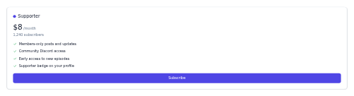
subscriber-tier-card A membership tier card with price, benefits checklist, subscriber count, and a subscribe button.
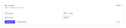
subscription-summary A plan summary with status, renewal, details, and manage actions.

subtask-checklist A card of subtask rows with a segmented progress bar and a done/total count, striking through completed items.

success-state A completed-confirmation with a check, summary, and next actions.
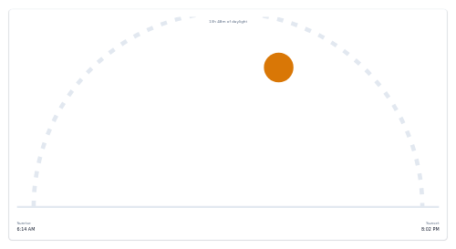
sunrise-sunset A daylight arc with the sun's position, sunrise, and sunset times.

super-chat-message A paid, highlighted live-chat message with an avatar, sender name, amount pill, and tier tint.
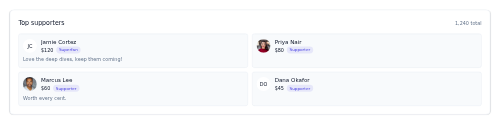
supporter-wall A thank-you wall of top supporters, each a tile with an avatar, name, amount or tier, and an optional message.

survey-progress A step "Question X of Y" indicator with a precomputed completion bar for multi-step surveys and quizzes.
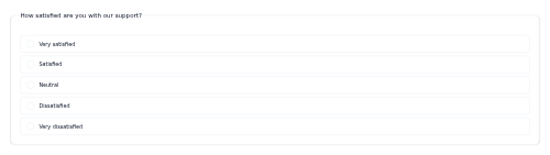
survey-question A single survey question with selectable option rows for single, multi, or scale answers.
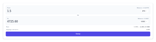
swap-widget A token swap interface - a From panel, a To panel, a flip button between them, a rate line and a primary Swap action.
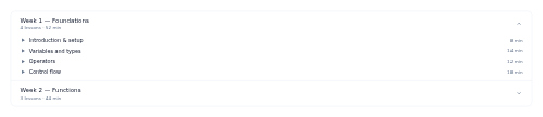
syllabus-accordion An expandable course syllabus grouped into sections of lessons.
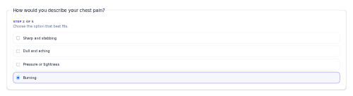
symptom-checker-step A single symptom-checker question with selectable answer options.

tab-card A compact open-tab card showing the guest, item count, and running total.

table-availability Reservation time-slot chips with available and unavailable states.
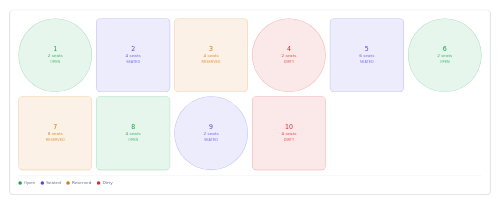
table-map A stylized restaurant floor-plan facade of table tiles colour-coded by occupancy status.

table-of-contents A sticky in-article contents nav that tracks the active section on scroll.

tabs A horizontal ARIA tablist with arrow-key navigation that toggles matching content panels.

tag A small content keyword/tag label, optionally removable.

tag-list A wrapping list of topic tag links.
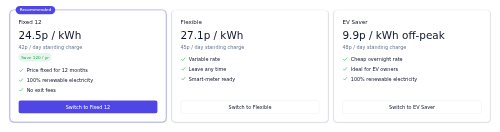
tariff-comparison A side-by-side comparison of energy tariffs with rate, standing charge, features, and a Switch button per plan.

task-card A compact task tile with a tag, title, coloured priority pill, subtask progress, due date, and assignee avatar.

task-followup-row A CRM follow-up task row with a completion checkbox, title, related contact, and a due-date pill that flags overdue.
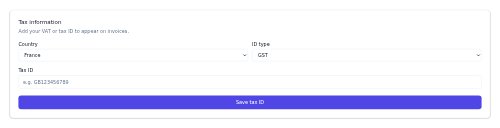
tax-id-form A VAT/tax ID entry form with country and ID type.

team-card A national/club team card with crest badge, name, group, record, and FIFA rank.
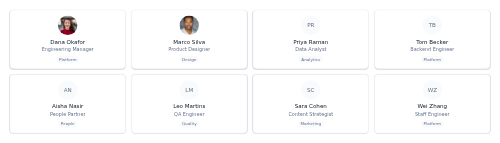
team-directory-grid A responsive grid of compact people cards showing each person's avatar, name, title and department.

team-grid A responsive grid of team members, each with a round avatar (or initials), name, role, and optional social links.

card-team-member A compact team member card whose social links reveal on hover/focus.

team-member-row A single team-member row showing avatar, name, email, role, an optional status pill, and an actions menu button.

technician-card A roster card showing a field technician's availability status, location, workload and rating.
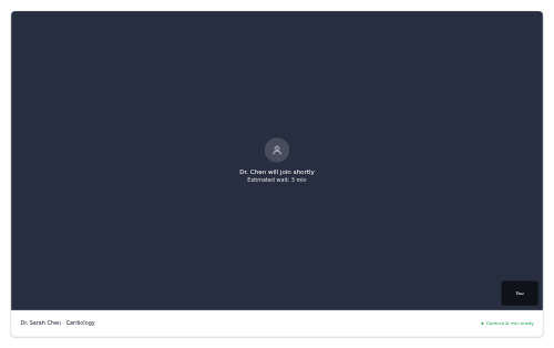
telehealth-waiting-room A pre-call waiting screen with provider status, wait time, and self-preview.
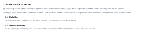
terms-section A numbered legal section with a heading, rich-HTML body and optional nested subsections, for building terms and policy documents.
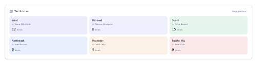
territory-map A CRM territory-assignment facade - a stylized grid of region tiles showing the assigned rep and open-deal count, standing in for a real map.
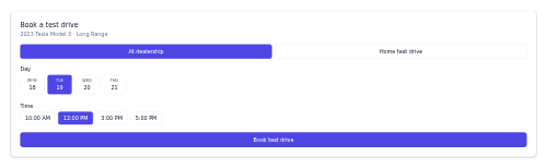
test-drive-booker A test-drive scheduler with mode (dealership/home), day, and time.

card-testimonial A customer quote card with an optional star rating and an attributed author.
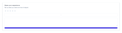
testimonial-collect A request-a-testimonial card with an interactive star rating, name/role fields, and a message box.

testimonial-slider A rotating testimonials carousel with prev/next controls.

testimonial-spotlight A single, centered client testimonial with a large quote mark, author, and optional company logo.

form-field-text A labeled text input with help text and a validation/error state.

thermostat-dial A circular thermostat gauge showing the target set-point, current reading, and mode.
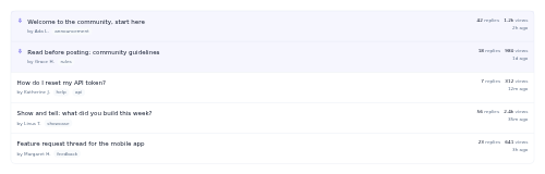
thread-list A divided list of forum topics — each row shows title, author, tags, reply and view counts, and last activity, with pinned rows highlighted.

thread-message One message card in an email conversation, expandable or collapsed to a one-line preview.

thread-row A single forum-topic row showing the title, author, tags, reply and view counts, and last activity, with an optional pinned state.
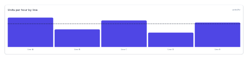
throughput-chart A card-framed vertical bar chart of production throughput with an optional target line and below-target bars tinted warning.

carousel-thumbnails A large media viewer with a horizontal thumbnail strip that selects which frame is shown, with an optional per-frame caption.

thumbs-feedback A one-line "Was this helpful?" prompt with Yes/No thumb buttons that highlight the chosen answer.

ticket-card A single ticket-tier row with a price and a quantity stepper, used inside ticket-selector.
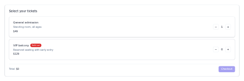
ticket-selector An organism that lays out ticket-card tiers and totals a running price with a checkout CTA.

tide-table A high/low tide schedule with times and heights.
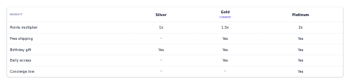
tier-benefits-table A comparison table of loyalty benefits (rows) across membership tiers (columns), with the member's current tier column highlighted.

tier-progress A card showing how far a loyalty member has progressed from their current tier toward the next.

time-log-row A single timesheet row — who logged time against what, when, and how long.

time-off-balance A card listing leave types with days used out of total and a coloured usage bar per type.

time-on-site A count-up on-site timer card with a large elapsed clock, start time and Start/Pause/Stop controls.
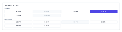
time-slot-grid A bookable time-slot grid grouped by period with available/booked states.

timezone-picker A timezone select dropdown with offsets.
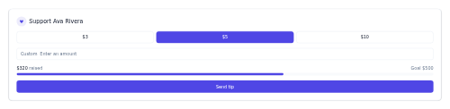
tip-jar A compact card for sending a one-off tip, with preset amount buttons, a custom field, and an optional goal bar.

tip-selector Preset and custom tip buttons showing the tip percentage and amount.

tip-out-row A single staff row for a tip-out sheet - avatar, name and role on the left, sales, rate and the tip-out amount on the right.

notification-toast A transient corner toast with a severity accent that auto-dismisses.

form-field-toggle An on/off switch field with a label and help text.

toggle-setting-row A single settings row pairing a label and help text with an on/off switch.

token-balance-row A single-line token holding - glyph, name and symbol on the left, amount, fiat value and optional change on the right.

token-price-card A compact token price card - symbol and name, a large price, a coloured change pill and a sparkline.

token-usage A compact meter showing tokens used against a limit, with an optional running cost.
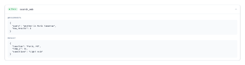
tool-call-card A collapsible card showing an AI tool invocation - its name, arguments, result, and status.

tooltip A hover/focus tooltip panel attached to any trigger element via a slot.
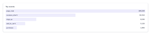
top-events-list A ranked list of events/pages with counts and inline bars.
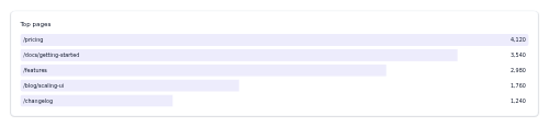
top-list-widget A ranked top-N list with values and subtle inline bars.
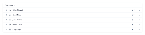
top-scorers-list A ranked list of top scorers with goals and assists.

topic-header A section masthead with title, description, follow, and section tabs.
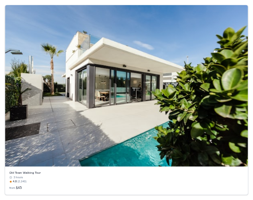
tour-card An excursion card with image, duration, rating, and from-price.
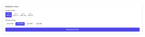
tour-request-form A schedule-a-tour capture with selectable day and time chips.

track-row A song row with index/play, cover, title, artist, and duration.

tracking-timeline A vertical timeline of shipment scan events, most recent first, marking done versus pending steps.

trade-confirmation A compact fill-confirmation card summarising an executed order - side, quantity, symbol, price, total, and status.
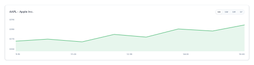
performance-chart-trade A card-framed price-performance line chart with a timeframe selector, an optional filled area, and a direction-tinted line.
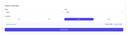
trade-in-estimator A trade-in value form with make/year/condition and an estimate range.

transaction-hash A truncated transaction hash in the mono face with a copy button and an optional link to a block explorer.
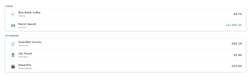
transaction-list Transactions grouped by date, each with merchant, category, and amount.

transaction-row A transaction line with merchant, category, date, and amount.
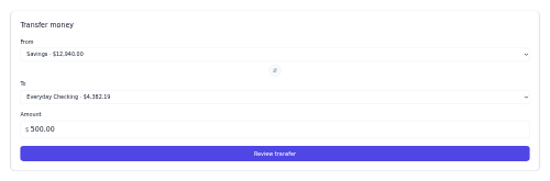
transfer-form A money transfer form with from/to account selects and an amount.

transfer-list A dual-list picker for moving items between an available and a chosen list with selection and move controls.

translate-bar A compact language-selection strip — a globe icon and a row of language buttons, with the current language highlighted.

transparency-breakdown A single stacked bar plus legend showing how each dollar is split across spending categories.

travel-mode-switch A drive/walk/transit/bike toggle with per-mode ETAs.
tree-nav A collapsible multi-level tree for docs-style sidebars, built from native details/summary with no JavaScript.
tree-view A nested, expandable tree for file explorers and hierarchical data, built from native details/summary with no JavaScript.
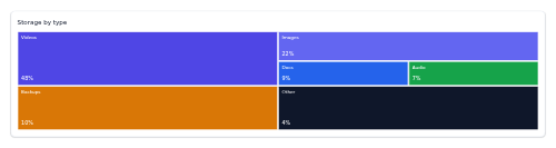
treemap-shell A tokenized treemap skeleton that tiles a plot box with proportional coloured rectangles from caller-precomputed layout,.
trend-carousel A horizontally scrolling carousel of trending looks with prev/next.
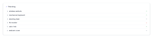
trending-searches A compact panel listing the most popular search queries, each with an optional rank and up/down/flat trend indicator.

triage-badge A severity-level pill for triage (routine, urgent, emergency).
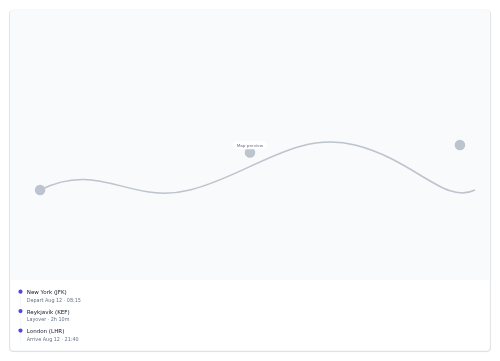
trip-map A route overview with a map placeholder and a stop-by-stop list.
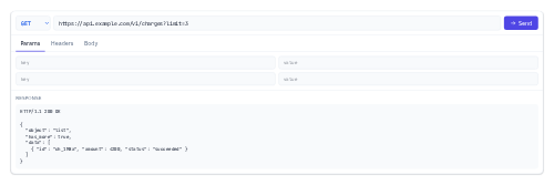
try-it-console A live API request-builder skeleton - method + URL bar, Params/Headers/Body tabs, and a response area.
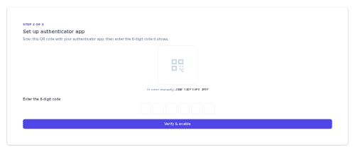
two-factor-setup A 2FA enable flow with a QR code, manual secret, and code verification.

match-card-upcoming An upcoming fixture card with both teams, kickoff time, and venue.

upgrade-prompt A hit-a-limit upsell with usage bar and an upgrade CTA.
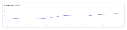
usage-forecast A card-framed line chart of measured energy usage with an optional dashed forecast continuation.

usage-meter A quota used-vs-limit bar with status colour and reset note.

user-flair A tiny colour-coded pill badge shown next to a username to mark a role like moderator, admin, OP, pro, new or VIP.
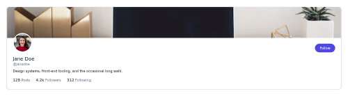
user-profile-header A profile header with banner, avatar, name, handle, bio, stats, and follow.

uv-index A UV level meter with the value, category, and sun-safety advice.
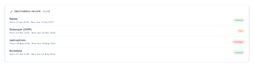
vaccination-record A pet shots history card listing each vaccine with its date, next due date, and a colour-coded status pill.

color-picker-vehicle Exterior color swatches with the selected color's name and price.
vehicle-detail-hero A vehicle detail header with a gallery mosaic, price, and key specs.

feature-list-auto A grouped equipment checklist showing included and not-included features.
vehicle-listing-card A car listing with photo, trim, key specs, price, and a status badge.
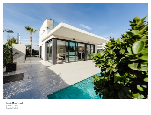
venue-card A stadium card with image, name, city, and capacity.
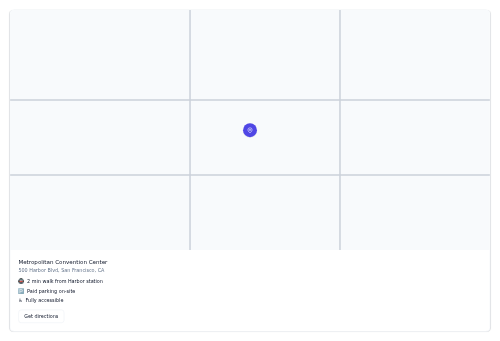
venue-info A venue panel with a map placeholder, address, details, and directions.

seat-picker-venue A venue seat map with a stage, sections, and selectable seats.

version-selector A compact dropdown for switching between doc or API versions, with Latest/Beta badges and a check on the current one.

tabs-vertical A vertical ARIA tablist with Up/Down navigation that toggles matching content panels.
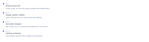
timeline-vertical A vertical event timeline with dated entries down a connecting line.

vet-appointment A pet vet visit card showing the clinic, vet, date, time, reason, a status pill, and Reschedule and Cancel actions.
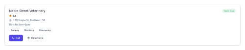
vet-clinic-card A directory card for a veterinary clinic, with open status, rating, address, service chips and Call and Directions actions.
video-chapters A list of chapter markers with thumbnails and timestamps that seek on click.
video-grid A responsive grid of video thumbnails with title, channel, views, and duration.

video-hero A full-bleed hero with a poster/video backdrop, overlaid title, and a play CTA.

video-lesson-player A lesson video player with notes/transcript/resources tabs.

video-player A VOD player skeleton with play/pause, seek scrubber, volume, speed, and fullscreen.

video-playlist-item A horizontal video row with thumbnail, title, channel, duration, and now-playing state.
video-premiere A countdown wrapper over a video (live or on-demand) that reveals it at the start time.

video-scrubber A standalone timeline scrubber with played and buffered ranges and a hover thumb.

video-transcript A synced, click-to-seek transcript that highlights the active cue.
virtual-list A windowed long-list shell - a fixed-height scroll container that renders one visible slice of a large dataset.
virtual-tour-embed A 360/3D virtual tour player shell with a poster and start control.

vitals-tile A vital-sign tile with value, unit, normal range, and status.

void-comp-row A single void or comp entry - the item and amount, a colour-coded void/comp pill, and the reason plus who authorised it.

volume-control A volume slider with a mute toggle.
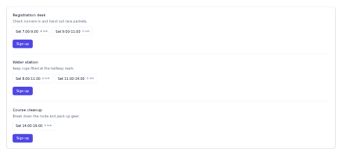
volunteer-signup A role-and-shift signup panel where a volunteer picks an open shift for a role and commits to it.

vote-control A stacked up/down arrow control with a score between them, highlighting the active vote and toggling off on re-click.

waitlist-form A join-the-waitlist email capture with a position note.
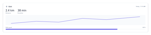
walk-tracker A card logging a pet's walk - distance and duration, a route facade and progress toward the daily goal.

wallet-connect A connect-wallet control that opens a wallet picker, then shows the connected account as a masked-address pill.

warehouse-bin A storage-bin card showing its ID, zone, stored SKU and a capacity fill bar with a tone that flags near-full bins.
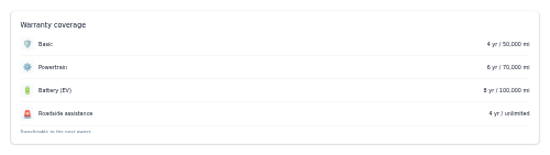
warranty-card A warranty coverage summary listing each type and its term.

watch-next-rail A horizontal, scrollable rail of up-next video thumbnails.

watchlist-row A single watchlist line - symbol and name, current price, a change pill coloured by direction, and an optional mini sparkline.

water-intake A hydration card showing cups consumed, current vs goal millilitres, a progress bar, and an add-serving button.
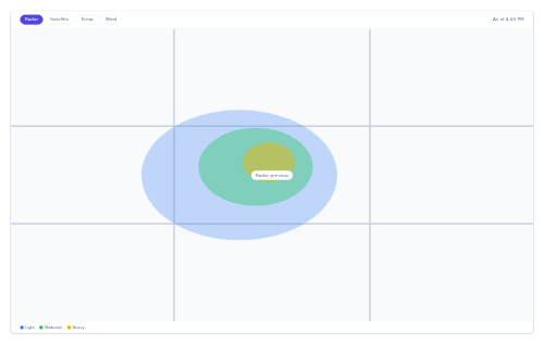
weather-map A radar map shell with layer toggles and an intensity legend.

weather-strip A compact current-conditions bar with a short forecast.

webhook-row A single webhook endpoint row showing its event, destination URL, delivery status and last attempt.

welcome-modal A first-run welcome dialog with highlights and get-started.

widget-card A generic dashboard widget shell with a header, actions slot, and body slot.

widget-empty-state An empty-state placeholder for a dashboard widget with an icon, message, and CTA.
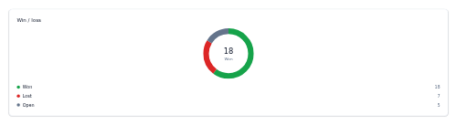
win-loss-summary A CRM deal-outcome donut showing won, lost, and open counts from caller-precomputed slice geometry.

wind-compass A wind direction dial with speed and gusts.

wishlist-button A save/favorite heart toggle for products.
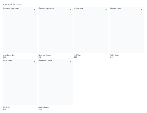
wishlist-grid A grid of saved fashion items with per-item remove controls.

work-order-card A production work order card showing the order number, product, quantity, due date, status and priority.
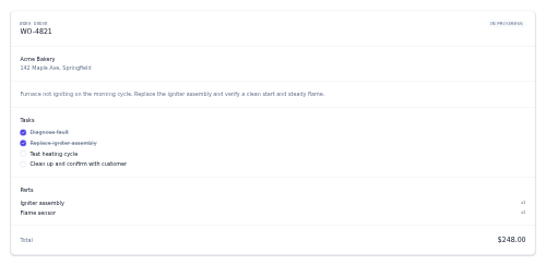
work-order-detail A full work-order view with description, a task checklist, a parts list and a total.

work-tile A single 4:3 project thumbnail that zooms on hover and reveals the title and category over a dark gradient.
workout-card A compact card for a single workout — cover image, title, duration, intensity and calorie burn.

workout-timer An interval work/rest countdown timer with rounds and start, pause and reset controls.

workspace-switcher A dropdown that shows the current org/workspace and switches between the ones a user belongs to.
world-map-stat A geographic stat widget with a map placeholder and a ranked country list.

video-player-youtube A YouTube-embed player with a custom skeleton control bar that broadcasts position for a synced transcript/chapters.
No components match.