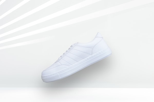
Court Classic
$89
 Magoo Component UI
CSS-less skeletons · 4 themes
Magoo Component UI
CSS-less skeletons · 4 themes product-grid organism experimental A responsive product listing grid (2→3→4 columns) for product cards.
The width preview needs a screen wider than the chosen width — use a larger device (or a desktop browser) to see the desktop and tablet layouts.
$89
$119
$139
$79
commerce/product-gridname: "Product Grid"
short_description: A responsive product listing grid (2→3→4 columns) for product cards.
long_visual_description: >
A responsive grid that arranges product cards from two columns on mobile up to four on
desktop with consistent gaps.
use_cases:
- Category or search product listing.
- Collection or sale grid.
- Storefront product showcase.
- Brand or vendor product page.
- Recommendations grid.
recommended_for:
- Laying out a set of product cards responsively.
avoid_for:
- Mixed content grids (use card-grid).
markets:
- Global
example_usage: >
Slot product cards into items; the grid steps 2→3→4 columns. The column classes are
safelisted in the Tailwind build.
props: {}
slots:
items: The product cards to arrange.
example_prompts:
- "Add a responsive product grid of product cards."
- "Add a 2/3/4-column product listing."
relationships:
children:
- cards/card-product
lifecycle: experimental
content_model: A responsive grid of product cards.
theming:
tokens_used:
- --space-card
editorial_guidance: >
Keep the slotted cards a single product-card type for a tidy grid.
categorization:
category: Commerce
subcategory: Catalog
atomic_type: organism
usage_type: [grid]
maturity: ai-generated
wcag:
level: AA
notes: Purely a layout container; accessibility depends on the slotted product cards.
keyboard_support: "none"
seo_score: 40
text_direction: both
| Name | Type | Req |
|---|---|---|
| gap | enum (default | none | sm | md | lg | xl) |