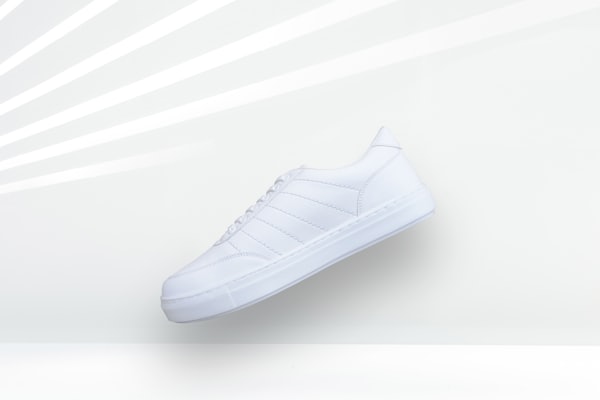
Tour Hoodie 2026
Upcoming Live now Sold out
Sold
72%
 Magoo Component UI
CSS-less skeletons · 4 themes
Magoo Component UI
CSS-less skeletons · 4 themes merch-drop-card molecule experimental A merch release card with a product image, price, an optional sold-through bar, a status badge, and a buy or notify button.
The width preview needs a screen wider than the chosen width — use a larger device (or a desktop browser) to see the desktop and tablet layouts.
creator/merch-drop-cardname: "Merch Drop Card"
short_description: A merch release card with a product image, price, an optional sold-through bar, a status badge, and a buy or notify button.
long_visual_description: >
A product card with a square image on top, the product name and a status badge in a header row,
and a price with an optional drop-date label. When the drop is live an optional sold-through
progress bar appears. A full-width action button anchors the bottom and changes with the status:
"Notify me" for upcoming, "Buy now" for live, and a disabled "Sold out" once stock is gone. The
badge colour tracks the status too (upcoming info, live red, sold-out muted).
use_cases:
- Announcing a limited merch drop on a creator store.
- A grid of upcoming and live product releases.
- A sold-through countdown for a limited run.
- A pre-order or notify-me card for an unreleased item.
- A tour or event merch highlight.
- A collectible or print drop with scarcity signalling.
recommended_for:
- Time-boxed or limited-stock product releases.
- Grids mixing upcoming, live, and sold-out drops.
avoid_for:
- Always-in-stock catalog products (use a standard product card).
- Membership tiers (use subscriber-tier-card).
markets:
- Global
example_usage: >
Give it a name, image, and price, set status to drive the badge and button, and pass a precomputed
sold_pct for the sold-through bar on live drops. The button is a facade for the caller to wire to a
real buy or notify flow.
props:
name: "Product name."
image: "Square product image; omit for a plain panel."
price: "Formatted price including currency."
drop_date: "Short date or time label shown beside the price."
sold_pct: "Precomputed percent sold (0-100) for the bar; omit to hide it."
status: "Drop state: upcoming, live, or sold-out; sets the badge and button label and colour."
lifecycle: experimental
content_model: >
A product name and image, a price, an optional drop date, an optional precomputed sold percentage,
and a drop status that drives the badge and action label.
theming:
tokens_used:
- --color-surface
- --color-surface-raised
- --color-on-surface
- --color-on-surface-muted
- --color-border
- --color-primary
- --color-primary-contrast
- --color-info
- --color-danger
- --radius-card
- --radius-button
- --radius-control
- --radius-pill
- --shadow-card
- --font-heading
- --space-card
- --duration-token
editorial_guidance: >
Keep names short and let the badge signal urgency. Show the sold bar only when a live drop is
genuinely selling through, so scarcity reads as real.
relationships:
related:
- creator/subscriber-tier-card
- creator/revenue-dashboard
categorization:
category: Creator
subcategory: Merch
atomic_type: molecule
usage_type: [card, grid]
maturity: ai-generated
wcag:
level: AA
notes: Status is conveyed in the badge and button text, not colour alone; the sold-out button is visually and interactively disabled via pointer-events; images use empty alt as decoration beside the text name.
keyboard_support: The action button is focusable and activates on Enter/Space; it is non-interactive when sold out.
seo_score: 40
text_direction: both
| Name | Type | Req |
|---|---|---|
| name | string | ✓ |
| image | string | |
| price | string | ✓ |
| drop_date | string | |
| sold_pct | string | |
| status | enum (upcoming | live | sold-out) |