
 Magoo Component UI
CSS-less skeletons · 4 themes
Magoo Component UI
CSS-less skeletons · 4 themes
Magoo Component UI
CSS-less skeletons · 4 themes
Magoo Component UI
CSS-less skeletons · 4 themes load-more-grid organism experimental A responsive card grid that shows a first batch of items and reveals more, a step at a time, from a Load more button.
The width preview needs a screen wider than the chosen width — use a larger device (or a desktop browser) to see the desktop and tablet layouts.





layout/load-more-gridname: "Load-more Grid"
short_description: A responsive card grid that shows a first batch of items and reveals more, a step at a time, from a Load more button.
long_visual_description: >
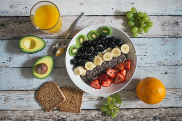
A responsive grid of preview cards (image over an eyebrow, title and subtitle) that starts by
showing a fixed number of items and hides the rest. A centered Load more button sits below the
grid; each click reveals the next step of cards and moves keyboard focus to the first newly shown
card. The grid runs one column on mobile, two from the sm breakpoint and three from lg. When every
item is visible the button disappears.
use_cases:
- A blog or news index that pages in more articles on demand.
- A resource or documentation library that starts compact.
- A product or collection listing revealed in batches.
- A portfolio or case-study grid that grows on click.
- A search or category results grid without full pagination.
- Any long card set where an initial subset keeps the page short.
recommended_for:
- Card sets long enough that showing all at once would overwhelm the page.
- Grids that render from structured data (image, title, subtitle, link).
avoid_for:
- A horizontally scrolling rail (use layout/carousel-grid).
- A short set that fits on screen with no reveal needed (use cards/card-grid).
markets:
- Global
example_usage: >
Pass an items array (each { image, eyebrow, title, subtitle, href }) and set initial to how many
show first and step to how many each click reveals. The grid layout and card styling are pure CSS;
behavior.js handles the reveal and hides the button when everything is shown.
how_to_use: >
The reveal is wired by behavior.js reading two data-* attributes on the section: data-initial (set
from the initial prop) is how many cards show before any interaction, and data-step (from the step
prop) is how many each Load more click reveals. On init every item past the initial count gets the
hidden attribute; each click removes hidden from the next step of cards and focuses the first newly
revealed card's link. When no hidden items remain — or when the item count is already at or below
initial — the button itself is given the hidden attribute so it drops out. The portable self-init
passes no props object, so all config must be read from the data-* attributes.
props:
items: "The cards, in order. Each item: image (optional), eyebrow (optional kicker), title, subtitle (optional), href (optional — makes the whole card a link)."
initial: "How many cards show before the first Load more click: 3, 6, 9 or 12."
step: "How many additional cards each Load more click reveals: 3, 6 or 9."
gap: "Space between cards: default, or an explicit none/sm/md/lg/xl."
button_label: "Text on the reveal button."
label: "Accessible name announced for the grid region."
lifecycle: experimental
content_model: A responsive grid of preview cards rendered from an items array, revealed in batches.
theming:
tokens_used:
- --color-surface
- --color-surface-raised
- --color-on-surface
- --color-on-surface-muted
- --color-border
- --radius-card
- --radius-button
- --shadow-card
- --duration-token
- --font-heading
editorial_guidance: >
Keep the cards a single type and order them by relevance so the first batch carries the strongest
items. Match initial to your grid width — 6 fills two full rows at three columns. Because
screenshots do not run behavior.js, every item renders in a static capture; the initial-count
limiting only takes effect in a live browser.
relationships:
related:
- cards/card-grid
- layout/fluid-grid
- layout/carousel-grid
categorization:
category: Layout
subcategory: Grids
atomic_type: organism
usage_type: [grid]
maturity: ai-generated
wcag:
level: AA
notes: The grid is a labelled region, hidden cards use the hidden attribute (removed from the a11y tree), and revealing a batch moves focus to the first new card's link so keyboard users are not left behind.
keyboard_support: The Load more button is a native button focusable and activated with Enter/Space; each reveal moves focus to the first newly shown card's link.
seo_score: 30
text_direction: both
| Name | Type | Req |
|---|---|---|
| items | array | ✓ |
| initial | enum (3 | 6 | 9 | 12) | |
| step | enum (3 | 6 | 9) | |
| gap | enum (default | none | sm | md | lg | xl) | |
| button_label | string | |
| label | string |
The reveal is wired by behavior.js reading two data-* attributes on the section: data-initial (set from the initial prop) is how many cards show before any interaction, and data-step (from the step prop) is how many each Load more click reveals. On init every item past the initial count gets the hidden attribute; each click removes hidden from the next step of cards and focuses the first newly revealed card's link. When no hidden items remain — or when the item count is already at or below initial — the button itself is given the hidden attribute so it drops out. The portable self-init passes no props object, so all config must be read from the data-* attributes.